- I like the line of info-graphic/vector images. You do need both image and text for the links. I like the clean neat aesthetic, it's very relative to the tube map design.
- Consider size of images because sometimes bigger images can look tacky/pixelated
- Could you incorporate the underground map in someway? Only one stands out to me as a link to the London Underground. How can you make the homepage resemble London Underground better? Never the less, good initial layouts
- I think a small brief statement on what each icon is would work well and be more clear. I like the idea of incorporating the icon map.
Creating a style sheet to allow us to use fonts on the web
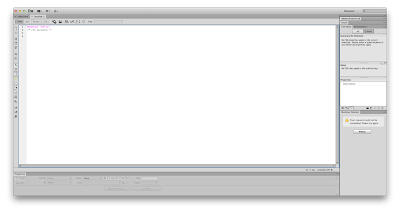
New document
Blank page, CSS
CSS document only allows us to preview the code not the design.

first line of code is the font we are using. The keyboard
Second line is a note - this is for the designer and will not show up in the design.
To write a note we do /* to open and */ to close. It will show up in a light grey colour.
selecting a font family
close the setting with a ;
close the body with }
adding our stylesheet to our html index document
CSS Styles > Properties > Chain symbol > Browse > Stylesheet doc > Ok
It has put the code before the close head tab because it is not something we want to see.
how we know it has worked
The font has been changed to Courier
Coding the design of a website..
The design is all within a container which is specific to the size we chose to have.
We have chosen to have our container at 1024px wide and 768px high
adding a background colour.
Adding the code from our CSS file to the Index html file
We add it to the body section because it is something we want to see.
previewing our design in google chrome. There is a preset 10px border around the design
we combat this on dreamweaver on our stylesheet
We use absolute, fixed and relative
the 0 allows us to get rid of the border
Align to the centre.
This alone does not achieve this.
we simply decrease a margin which is half of the width of the container, this will allow the page to be in the centre of every screen.
Adding a navigation bar to the top of the site
Adding the code to our html doc
Adding a logo
we were given 3 mins to draw out a logo on illustrator
in stylesheet
in source code html
the logo appears in the nav bar
in illustrator 2 layers
code in stylesheet
Adding button to website
the Java script code is added for us
The rollover button


Leave your comment