- The bleed is for trimming. Anything which is going to be printed will always be printed on paper larger than the intended format which will allow for successful trimming.
- The Slug area is used for printers marks, registration marks and colour bars.
- Facing pages with present our work in two pages which are side by side - booklet format
- Primary text frame - If the majority of the page will be text it will automatically add a text frame to each page. Text heavy documents
- Starting page number - If we do not want the first page of our document to be the first page of the publication
To apply colour we must add it to a shape. It is the same way as adding colour on Illustrator.
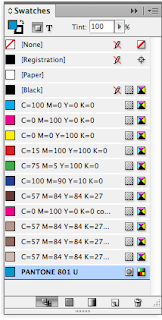
Using the swatch palette it is very easy to make global changes to a colour which has been used on the page.
Adding swatches and changing the tint several times..
If we altered the 100% swatch it would alter all of the other shapes because it is global.
Adding spot colours..
New swatch and choose the different pantone books which are available.
We can type in the pantone number and this will add the pantone swatch to the swatch bar.
Adding the pantone swatch to the shapes.
Previewing an image will show us the greyscale image.
Any spot colours which we have used on Photoshop will be added to the swatch palette in indesign.
Spot colours will also be added..
Same for illustrator files..
Photoshop:
- Resolution 300dpi - print resolution
- Actual size - images need to be prepared in Photoshop so they are the size that they are going to be in the inDesign document
- CMYK or SPOT
- TIFF or PSD
Illustrator:
- Dont have to consider resolution
- CMYK and SPOT
- .AI
- COPY and PASTE
C
M
Y
K
& 1 SPOT COLOUR
5 COLOURS OVERALL
Indesign can separate the image into the different inks
This will show us how the inks will be separated.
There will be a slight change to the document - images will increase in quality
Viewing the different colours will allow us to see how each of the individual inks will be applied
Indesign will separate each of the colours and will allow the printer to print out a negative for each colour which we are using.
We need to use half tones to print photographic images.
Over printing or Knocking out
What happens during the separation process

By viewing the Cyan shape it will knock out the colour underneath where it overlaps.
And Visa Versa
Default to black is over printing. Black would cancel out other inks.
The black would obliterate a yellow
Ink can either knock out or over print
Window - Output - Attributes
Overprint fill will allow us to see what the ink would look like if they mix
We can only see this in Overprint Preview


Leave your comment