Showing posts with label Studio Session. Show all posts

OUGD505: Design Practice 2 - Typography Workshop Graham Tansley

Look at Paul Oliver

Today we had our first session with Graham which was all about typography. Graham runs the Visual Communication course and specialises in typography.

The Guttenberg press in 1452 revolutionised typography. The press allowed books to be produced, before the press the only books that were around we religious. The introduction of books gave people the power to talk about different subjects. The current revolution: It no longer costs money to publish a book.

The first task Graham set us was to type out our first name in a font which best represents us:


We set out our laptops up into a mini installation and went through each of the names to try to figure out the personality of the person represented. This task was very interesting and also eye opening. Graham described how each of us have our own font; our voice.

We were then tested on our type knowledge. We looked at small caps, these are used for terms and conditions and small print so a message can be displayed which is not intended to be read. To use numbers in typography they are called figures. There can be lining figures and non lining figures. (lining - fitting between the baseline and x-height.

The first book was produced in a Black Letter font, this is because it looked like hand writing. Books were printed in hand writing because people were most used to it. Fonts which we use at the moment are primarily designed for print, we use them because we are used to them.

For a final task Graham gave us a job title and asked us to create a business card, using only text, which represented the career we were given. I was given Joiner.


I chose a serif font as I know that joiners work with wood quite often. I also decided to display my name in larger font than my job title because I think this is a better way to portray oneself and also seems more trustworthy. 

When we went back to the mini installation with our designs Graham pointed out many different designs and mentioned that having the name of the person in a larger font than the title makes the person seem more approachable. I think this is very true and I hope that my business card would not be intimidating but friendly.

I found this session incredibly enjoyable and wish that we were given more sessions like this for other modules.

OUGD505: Design Practice 2 - Design Boards Workshop

Product, Range and Distribution


Today we were given studio brief which is part of the research brief we were set over the past week. We presented our design boards for the research we had collected and received feedback on them. 


The feedback I received from my presentation was mostly positive and the ideas I presented were met with some interesting concepts and opinions. We had only 3 minutes to present which I do not think was enough time, I have a lot of information to explain within my topic and I felt like the process was rushed.

After this crit we were sent into a session about design boards. In this session we would identify what should and shouldn't be on a design board.

Shouldn't:

  • Initial sketches
  • First person
  • Spelling mistakes
  • Bad printing
  • Poor image quality
  • Too much text (TLDR)
  • All uppercase words
  • Not enough text (scrapbook)
Should:
  • Name
  • Numbers
  • Titles
  • Final Work
  • Professional Photography
We got our boards out from the previous module and had a partner look through them to identify the mistakes within it. Not surprisingly there were a lot of small mistakes (grids not lining up perfectly, spelling, capitals etc) these were identified by our partners and also by other people in our groups. 

I found this session very helpful as it opened my eyes to how many mistakes graphic designers make within their design boards. I aim to, in the future, have someone proof read my design boards at least once before it is either printed or submitted. 

OUGD504: Design Production - Creative Suite session 4

This session we were asked to look at the image below and pick out all of the problems with the document.


The problems we identified are as follows:

  • Heifer water jpeg file
  • Photograph isn't to scale top right
  • The photograph top right is RGB not CMYK
  • Registration colour has been used at the bottom
  • The other pantone isn't needed and can be deleted
  • The image at the bottom (rosette) has been enlarged and is low quality as a result
  • The cow image effective PPI is too high
  • Top cow image is too low resolution
  • Strolling logo is too high resolution

OUGD504: Design Production - Design for Web Final Crit

Today we had our final crit for web. It was done in the same format as the print crit which I think has positives and negatives. We had to leave the studio for one hour to allow the other group to crit our work. Last week I was very disappointed to receive only 2 forms of feedback but this week I had 5 different sheets. I presented my 5 design boards and left my laptop out for people to have a look and use my website.

 Design boards -

My Site so far:


Homepage


History page


Inspiration page


Submit page


Resources page


We were asked to leave some questions which we wanted feedback on for our site. I asked:

- How do you add a scroll bar?
- Do you think it would be better to use illustrations rather than photos?
- Do you think there is too much negative space?

The feedback I received:

1.

  • Sorry, not sure how to add a scroll bar
  • On the history page the photos fit nicely and create an easy way to view the content, however on the inspiration page they look out of place.
  • As for negative space the only page I see being a problem is the inspiration page. This is because it doesn't fit the grid and creates inconsistency in the website. 
2.
  • Sorry, same problem with the scroll bar.
  • I think if it was prodomonently for children on the website then yes use illustrations. Because children will be on the history page then yes use them on there. It makes the page less serious and more playful for them. It is maybe a bit too formal. You could have information on the image when the mouse is moved over it. 
  • I think the links and history page should have the same layout for consistency. Maybe use the images as the links?
3.
  • Sorry, having the same problem
  • Photos most effective for the history page as they add authenticity but illustrations would be better for the inspiration page as the photos look more randomly selected on this page.
  • An alternative background could benefit the site or consider an illustration with low contrast/opacity - however don't loose sight of the target audience - keep it simple
4.
  • Sorry I'm not sure about scroll bars try online tutorials
  • For the history page I think the images and text work really well together. However, the first trains paragraph is too long for the page
  • Depending on your skills and time I think photos would be best to keep consistency throughout you design. 
  • Considering the target audience is for teachers to show to children I think it is a bit broad. Are they primary or secondary school children? I think once you identify this then your design will follow.
  • I also think that when all your content is put in you can judge whether there is too much negative space. I think the homepage could do with some more images to make it engaging. 
5.
  • The more content you have you will get a scroll bar - could add padding-bottom to text box so it doesnt reach end of page, mess around with container heights, margins etc, W3SCHOOLS is good for tutorials.
  • Photos are good so keep them - would probably use just photos to keep it consistent
  • Think history is the best page for use of space - maybe try make each side on rest of pages equal to each other in terms of space used.
  • I would also make the nav links change colour/underlined when you're on that page so user know what page they're on.
Overall I think the crit was fine. There were some comments made within my feedback which were confusing and it was clear that the person had not read my design boards clearly. Other than that I found it very helpful and I have some changes to make which will improve my site before submission. 

OUGD503: Design Process - Responsive Session 3

In this session we had a quick re-cap of the module brief and the learning outcomes we have to adhere to. 

The design process which we work with is a negotiation with the client. We have to communicate proposals. We could design a final resolution but it could be something which the client does not like. 

Working on one project at a time is not something we will do in the industry. We will have multiple briefs at once which will be short and sharp. We have to look at cost from a students perspective, we have lots of long briefs to do at one time, blogging and development whereas industry professionals do not. Time costings for students takes up quite a large chunk of time. We have to manage our time correctly and efficiently. 

We need to be sure that we are making informed decisions about the briefs which we are choosing. We need to look at brief management and we need to start allocating time to different aspects of the briefs we are working on. 

Presentation with pitching and proposing is something which is really important. It is not just about the final resolution it is more about the ideas and development. The proposal helps to seal the job, presenting the work that will get paid for.

Project proposals -

10 steps to writing persuasive project proposals
  • Setting clear aims and objectives
Before picking a pen up and producing anything it is important to have a clear list of ideas.


Objectives start to look at the HOW.
HOW will it make and impact?

Aims are the changes that your project will make to the status quo. What is happening now? How are things?

Changes in peoples’ perceptions
Changes to the way people do things
Political Change
Social Change
The impact that your finished work is designed to have on a particular audience or user.

Aims should be really ambitious and creative. They should be things which we aspire to, changes we want to make.

We need to be writing these first before we write out proposals. 

Objectives are the methods or the activities by which you plan to achieve your aims. 

  • What research will you carry out
  • Where will you go for specialist information
  • What kind of people will you contact to help you along
  • What expert advice will you need
  • What processes will be involved
  • Which skills will be evidenced
  • What activities will take place
  • What pieces of finished work will be produced
One thing which will set us apart from other people producing the same brief is if we have considered the different objectives. It is important to look into the target audience. We should step outside of what everyone else is doing. The relationship between aims and objectives is very important, they are closely linked but they are distinctly different. 


Specific: What? Why? Who? Where? 
Not just research - think deeper into the concept and proposal. Be specific from the start. Our outcomes need to be measurable. Question what we have done, keep it on a specific day to day basis. At any given point we need to be able to review what we have done and what we haven't done. Lists!!

It is not can we do it, do we understand what needs to be done to pass it on to the right person. 

Are our outcomes achievable? Are they realistic? Do they fit the timescale? Is it possible?

We can propose something which is possible and achievable but it is not realistic for right now. It is ok to propose something which we cannot produce but it could still win the clients attention. If we cannot produce what we want then we can propose it.

If we come up with something which is a brilliant idea but we cannot produce it does that mean we have to scrap it? No! We can propose it.


Most people want the status quo because they understand it. 


What is the need?
Who needs the solution to the problem?
If it is not something we have researched or a fact do not bullshit. Don't make a statement which is not backed up. 

Who are they?

We need to understand who the clients customers are then it is possible for us to win. Audience needs to be something which we clearly think about. 

There is never one audience. The hidden audience is the client. We need to look into the client, who are they? Where do they go? What do they like? What part of the industry are they? Do they understand design? What are their values?

What are our goals? What are your ambitions? What are your values? Are you ethically driven? What are your motivations and how do they match with the client?

Words to avoid:
  • Unique
  • Nice
  • Special
  • Normal
  • Bland
  • Sleek
  • Definitely
  • Awesome
  • Basically
  • Eseentially
  • Totally interesting
  • Utilize
  • Like
  • Get 
  • Got
  • Chance
  • Actually
  • Really
  • Truly
  • Amazing
  • Everyone
  • Never
  • Always
  • Things
  • Life
  • A lot
  • Good
  • Bad
  • Cool
  • Whatever
  • Went
  • Boring
Make your proposal easy to read by:
  • Using professional template/layout
  • Using the appropriate tone
  • Not repeating yourself to pad it out
  • Asking two people to check your grammar and spelling before you submit
Check, check and check again. Proof read everything!

Begin with your vision of the ending in mind. 
  • The first thing we communicate is the vision of where things are going to end.
  • What is the solution?
  • What is going to be the result?
  • Start at the end
  • What are we trying to achieve?
  • We are probably not going to achieve it all ourselves but it doesn't mean that we can't propose it
  • What does the project require?
  • What criteria do you need to satisfy?
  • Who is the target audience?
Assume nothing
  • except that the reader of your proposal knows nothing about you, your skills are the context of your project. 
  • We cannot assume anything about the people who are going to be looking at it
  • We have to explain everything
  • Assume that the client knows absolutely nothing
Question everything. 
Accept nothing. 

In questioning everything we might break the brief and identify other solutions. 

If everyone does something in the same way… nothing will stand out. 

_________________________________________________________________

After Fred had given his talk we were split into groups of four and had to present our work so far on the brief we had chosen. 

  • humourous
  • appeal to men swell
  • rebrand
  • re focus
For next week:

What am I actually going to produce?

Answer the questions:

What can you do?
What could you do?


OUGD504: Design Production - Design for Print Creative Suite Session 3

In this session we worked with inDesign. It is important for us to use inDesign to pull together all of our text and image files.


  • The bleed is for trimming. Anything which is going to be printed will always be printed on paper larger than the intended format which will allow for successful trimming. 
  • The Slug area is used for printers marks, registration marks and colour bars. 
  • Facing pages with present our work in two pages which are side by side - booklet format
  • Primary text frame - If the majority of the page will be text it will automatically add a text frame to each page. Text heavy documents
  • Starting page number - If we do not want the first page of our document to be the first page of the publication
To apply colour we must add it to a shape. It is the same way as adding colour on Illustrator.

Using the swatch palette it is very easy to make global changes to a colour which has been used on the page. 

Adding swatches and changing the tint several times..


If we altered the 100% swatch it would alter all of the other shapes because it is global.


Adding spot colours..

New swatch and choose the different pantone books which are available.

We can type in the pantone number and this will add the pantone swatch to the swatch bar.


Adding the pantone swatch to the shapes. 


Previewing an image will show us the greyscale image. 


Any spot colours which we have used on Photoshop will be added to the swatch palette in indesign. 

Spot colours will also be added..


Same for illustrator files..


Photoshop:
  • Resolution 300dpi - print resolution
  • Actual size - images need to be prepared in Photoshop so they are the size that they are going to be in the inDesign document
  • CMYK or SPOT
  • TIFF or PSD
PSD files have layers which allow it to be edited. TIFF files do not support transparency.

Illustrator:
  • Dont have to consider resolution
  • CMYK and SPOT
  • .AI
  • COPY and PASTE

How to get from an inDesign document to the different plates with separate colours.


M
Y
& 1 SPOT COLOUR

5 COLOURS OVERALL

Indesign can separate the image into the different inks


This will show us how the inks will be separated.


There will be a slight change to the document - images will increase in quality

Viewing the different colours will allow us to see how each of the individual inks will be applied


Indesign will separate each of the colours and will allow the printer to print out a negative for each colour which we are using. 

We need to use half tones to print photographic images. 


Over printing or Knocking out

What happens during the separation process


By viewing the Cyan shape it will knock out the colour underneath where it overlaps.

And Visa Versa


Default to black is over printing. Black would cancel out other inks.

The black would obliterate a yellow

Ink can either knock out or over print


Window - Output - Attributes


Overprint fill will allow us to see what the ink would look like if they mix

We can only see this in Overprint Preview


OUGD503: Design Process - Responsive Session 2

Following on from the previous session we brought along the brief which we had chosen to work on for the coming weeks.

The start of the session had us working in groups of four and presenting the brief we had chosen to the group and getting feedback.

Issy - Purdey's
Laura - Fedrogoni
Me - Fem Fresh
Jnae - XL recordings

Common observations and questions we have from the presentation:

  • Vague brief
  • Harder than it looks
  • YCN seem more simple and easy to follow and understand
  • Broad audience 
  • Vague deliverables
With regards to the brief I have chosen:
  • 5 most important words?
- Women
- Convince
- Young users
- Sassy and Glamourous
- Campaign
  • 5 most important considerations?
- Young women are embarrassed about the brand
- They need to know that the product is there to help them
- Convince not scare them
- Older women use the brand already 
- There is a fine line between humour and offence 
  • 5 related products
- Tena
- Nirena
- Soap
- Vagisil
  • 5 related places
- Boots
- Wilkinsons
- Superdrug
- Supermarkets
- Pharmacies 

Laura's brief:
  • 5 Most important words
- Woodstock
- Useful
- Visual 
- High aesthetic standards
- Awareness

  • 5 Most important considerations
- Stock
- Client base
- Ultra functional
- Promote awareness
- Sustainability
  • 5 Related products
- Creative calendars 
- Other paper brands
- High quality printed designs
- Functional diaries
- Recycled products
  • 5 related places
- Printing studios
- Design studios
- Universities and creative institutions 
- Offices 
- Paper suppliers

J'nae feedback on my brief:

The feedback on my brief was very similar, this means that the other people who are entering the brief will produce something very similar. We need to think outside the box.

More questions on my brief:

  • Who is the audience?
- Women aged 18-24 who have an active interest in beauty messages.
  • Who should the audience be?
- All young women because they should be taking the appropriate care of themselves
  • Who could the audience be?
- Women of all ages who do not already use fem fresh
- Nurses? Who treat women everyday
  • Why?
- Women do not take the proper care of their intimate parts and this is probably because they are not aware of the specific care they should be taking. Using the product could combat any problems women are facing with regards to hygiene in that area.
  • What do they do?
Look after their body
  • Where do they go?
Beauty shops
  • What do they buy?
The product - Fem Fresh
  • What do they want to be?
Clean and hygienic

The purpose of this task is to clearly define the people we are trying to appeal to. 
The actual audience are the people who are going to judge me. They will take into account the audience they have specified but essentially it will be the judges. 

Next session :

  • Concept statement
  • Pre-written brief (written myself)
  • Initial development - Sheets and Contextual references
  • 5 reasons why your response will WIN

The idea is to re-write the brief to make it our own. This would mean that even though someone else might be doing the same brief they will be completely different.

OUGD504: Design Production - Design for Web Workshop 3

Creating our website:

At the start of the session we were asked to make the three other buttons for our website. We were told that they had to be a specific size and saved in a specific way.


Examples...


How to import these buttons to dream waver


adding another div id


selecting a roll over button


we choose the web buttons in this window


the button in place


How we link pages to others


Editing the code to link to the pages


 To link the pages we simply changed the name of the text inside the body and saved each page separately.


After we had been shown how to do this we were asked to link the other pages.


Diagram detailing the columns we are adding to the website


The box model..

Take the width that is available, add up all  of the different factors which we are planning to have, then minus it from the width.
20 px padding is the usual


Diagram to explain the box method


adding the code for the two columns


adding text before copy has been completed. we use Lorem Ipsum


formatting our type

<p> = paragraph break
<br> = line break

 here we can see the columns working

changing the font size...

in stylesheet after the font family..

font size:14px;

changing the colour

color:COLOURGOESHERE;


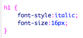
heading tags..


h1 in stylesheet


add it to html.


preview in safari.

We can have as many heading tags as we want


Adding an image to our website..


To upload video use Vimeo - embed
For audio use sound cloud and embed

Advantages -
  • does not use our bandwidth
  • streams it, it does not need to buffer


 Other options to work with...

  • Lightbox - image gallery


Copyright 2010. All rights reserved.

RSS Feed. This blog is proudly powered by Blogger and uses Modern Clix, a theme by Rodrigo Galindez. Modern Clix blogger template by Introblogger.