Thumbnails and idea development

These are my thumbnail ideas which I came up with during the web session. I wanted to talk in some detail about each of the ideas to help myself to develop them and decide which ideas work and which ones do not.

My first idea is to have the homepage mirror the design of the tube map which hopefully trigger an immediate reaction with the target audience. I want to make it very interactive and relate to the subject matter. My idea is to have the site act as a virtual experience for the user. I would like the whole site to be on one continuous page as I think this would be the most simple way of illustrating the tube lines and make the audience feel like they are a part of the site. I had the idea of some of the points on the homepage linking to one of the other pages which in my case would jump through the website to the one section about the specific subject. I think it is important to keep the user in charge of their web experience and let them be able to choose where they will be going next. I know that if I were to be looking at the site I would like the option of my own choice.

My second option is to produce something which is quite a standard template and would be very easy for a user to navigate around. I have taken inspiration from many different templates and other sites which use this layout. I have chosen to have my navigation bar on the left hand side of the page but I would also like to explore the idea of having it in the typical placement at the top of the page. I think that this way my homepage could become more than just a page with links to other pages on, it could act as another page of content. At the moment I have drawn out 3 images and one text box which would be on the page, this could be a short information/about explanation of what the site does and would allow the user to quickly identify if the site is what they are looking for.
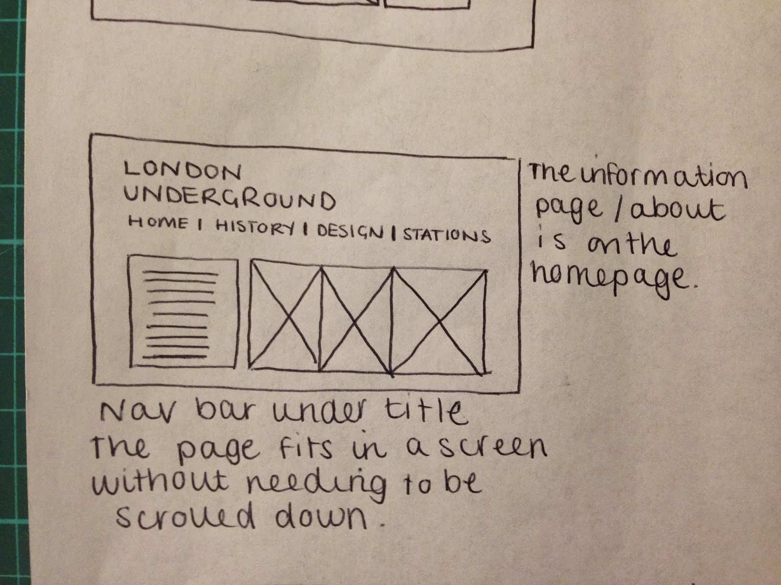
This is the other variation of the above design with the navigation bar along the top. This a more common layout for a website and might be a more simple option to go with. I have kept the content of the homepage quite simple but still informative. This is one of the least complicated ideas I have had and one which I think might work really well and gain good user experience. I would like to have the page fit within the constraints of the screen but I am aware that not all users are forced to have the same size screen and might be using a phone to view the content.

This option is one which I like very much. I would like to have a title at the top of the page with 4 circles (only drawn three here) each with an information graphic inside which link to another page. I think that info graphics would fit really well with the theme as the tube is a form of info graphic. The circle would link to the underground symbol and also from the map itself. I have three options with regards to identifying what is a link and what is not and they are to have each info graphic be a link to a page a rely on image alone to illustrate a topic or I could have the title of each page written underneath the info graphic which would make sure that the user would know they were a link failing all of these options I could have each link look like the underground logo/roundel. I have illustrated this above.

This idea is very minimal and uses negative space. The idea I have had is to have the title in the top left hand corner with a drop down menu which appears when the user clicks on the title. This idea is something which could be really different and has many positive and negative traits. A positive is that it will look aesthetically interesting and will make the user think but these could also be negatives. Users spend 2.5 seconds on a website before they decide to leave the page, a problem with having so much negative space is that the user might think it is not a website and might not know that the look at links they need to click on the title. I could combat this by having the menu permanently visible but I still think some users might not like the idea of the site and would not visit it.

This idea follows on from my first idea. I really like the idea of having the site move around like the user is on a virtual tour of the tube. I know that it is something I would be really interested in. The idea I have for this is to not have any links which the user can click on, it is simply a scroll to see. It would be a continuous page like the first idea I had but it would be a lot less interactive in terms of user experience. This idea would have the user dictated to and would take away the users freedom. Some people do not like this option and would not stay on the site for very long. I would have to mock up the idea and carry out a questionnaire to see what users think.

This idea is the most image based I have had. I was inspired by a site I saw on Awwwards. For this option I would have an image as the main point of the site and a navigation bar which pops up when the user hovers over the right hand side of the page. This is not a very common convention of navigation but it is a different user experience. The problem which could come with this idea is that I have to source all of my imagery and this would be very difficult due to my subject matter. My site would have to be very illustration based as I would have to draw out most of my imagery. This is not part of my style of working but it would show versatility.

This idea is very similar to my last one but the navigation bar would be fixed permanently at the top of the page. This would allow the user to see what links are available and give them the freedom of choice. The image I have drawn to represent the tube is a train which might not be the best image to represent my subject matter as I am mainly focussing on the tube map. I would need to use something which would make the user relate to the subject automatically which might be the underground logo.
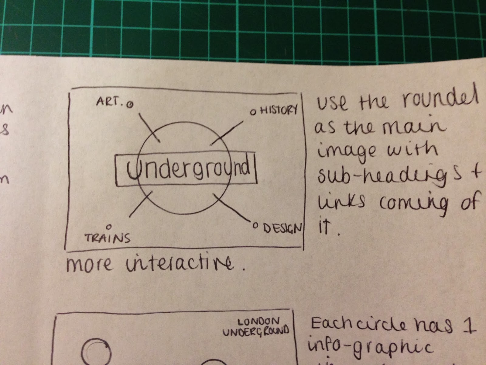
My next idea follows on from the previous, I really like the idea of having an image in the middle of the page which would allow the user to relate to the subject and the underground logo is probably the best suited to this. The idea I have is to have the logo in the centre with links coming off it. This might be quite difficult to produce across other forms of media (phone) but it would be a really interesting idea to develop further.

This idea is a follow on from the info graphic idea accept the circles will not be in any specific order. This idea does not necessarily link very well with the tube map because it is very organised and uniform but I think it would be great for user experience.

This idea is another continuous page concept, this would have much more content which is not shown with the design of the tube. I would have a typical timeline which gives details of the tube map and how it has evolved over the years. I would then have individual images which show the visual changes the tube map has gone through over the years. This idea would allow me to have lots more content on each page and also allows users to choose which page they want to view.

For my final thumbnail I wanted to expand on one of my previous ideas. The idea of having the tube logo in the centre of the page with the links coming out of the middle might be quite hard to produce so this is another variation of that idea. I would have the logo in the centre to allow user identification but I would also have a navigation at the top of the page. I think this idea would be really successful and really easy to navigate around.


Leave your comment