Archives

OUGD406 - Adobe InDesign Brief

Possible article for layout...

1.     All types of ducks are part of the bird family Anatidae, and there are a species of ducks found worldwide on every content except Antarctica
2.     A baby duck is called a duckling; an adult male is a drake. An adult female duck is called a hen or a duck, and a group of ducks can be called s raft, team or paddling.
3.     All ducks have highly waterproof feathers as a result of intricate feather structure and a waxy coating that is spread on each feather while preening. A duck’s feathers are so waterproof that even when the duck dives underwater, its downy under layer of feathers will stay completely dry.
4.     Ducks are precocial which means that ducklings are covered with down and able to walk and leave the nest just a few hours after hatching.
5.     A hen will lead her ducklings up to half a mile or more over land after hatching in order to find a suitable water source for swimming and feeding.
6.     Male ducks have an eclipse plumage similar to females that they wear after the breeding season for about a month as their new feathers grow. During that month, they are completely flightless and more vulnerable to predators.
7.     Most duck species are monogamous for a breeding season but they do not mate for life.
8.     When constructing her nest, a hen will line it with soft down feathers she plucks from her own breast. This gives the eggs the best possible cushioning and insulation.
9.     Ducks are omnivorous, opportunistic eaters will eat grass, aquatic plants, insects, seeds, fruit, fish, crustaceans and other types of food.
10. A ducks bill is specialised to help it forage in mud and to strain food from the water. A hard nail at the tip of the bill helps with foraging, and a comb-like structure on the sides of the bill strains small insects and crustaceans from water.
11. Most male ducks are silent and very few ducks actually “quack.” Instead, their calls may include squeaks, grunts, groans, chirps, whistles, brays and growls.
12. It is a myth that a ducks quack won’t echo. This has been conclusively disproved through different scientific acoustic tests.
13. Ducks have been domesticated as pets and farm animals for more than 500 years, and all domestic ducks are descended from either the mallard or the Muscovy duck.
14. There are more than 40 breeds of domestic ducks. The white Pekin duck (also called the Long Island Duck) is the most common variety raised for eggs and meat.
15. Because of their familiarity and comic nature, ducks are often featured as fictional characters. Two most famous fictional ducks are Disney’s Donald Duck, who premiered in 1934, and Warner Bros.’ Daffy Duck, who premiered in 1937.

OUGD406 - Communication is a Virus : Designers Dose

Our main outcome for this brief is an online resource in the form of a blog which informs young designers of the people they should be aware of in the industry. In order for people to become aware of this blog we have to ensure that we create the necessary material and send it to the appropriate people.


OUGD406 - Communication is a Virus : Development


I initially drew out some of my ideas for logos, names and concepts.


After a studio session with Simon about the importance of thumbnails and design sheets I  chose to produce thumbnail design ideas digitally as I feel it links more to our brief and is also a better way for me to visually communicate my ideas. 


Under each of my thumbnails I have put a short description of what I am trying to communicate. 


Caitlin's illustrations..


These are my preferred illustrations as I favour black and white design more than colour. After a group discussion we came to the decision that the colour illustrations were more appropriate.


After the crit we were all assigned a job. I was given the job of designing the business cards for our company. 


I created design sheets on Illustrator with 6 different shapes and different colour possibilities. As we have a lot of promotional material to print I wanted to keep the cost down by using white stock and adding colour to it. I experimented with the possibility of having the business card in full colour but I preferred the white background as I think it makes the text stand out more. 


_______________________________________________


After showing my variations to my group we decided on the full colour cards but tweaked them slightly. As a group of people we were expecting to have to alter a lot of the promotional material in order for it to remain consistent and work as a set. 


As the website has a long URL code it has posed some problems with the design from everyone. I had to make the point size smaller in order for it too look more effective and clearer to read. 


One problem with this design is the curved edges. It would take a lot of time to individually cut each card out. As this would impact our time scale and also cost I will have to produce this design in a simple square shape which can be strimmed in the studio, this will cut down the cost and also the time needed to cut.


OUGD406 - Communication is a Virus : Blog and Twitter

Over the past few days we have put together a blog and a twitter page. For the blog we have used Word Press as we wanted to make it look more professional. This was new for all of us as we had not used it before. I think we will start out with quite a basic blog but over the next two weeks we will upgrade it significantly therefore showing our progression throughout the project.

For now we have kept the header in the preset font from wordpress but we will update this when a logo is decided and designed.


We have begun to post each day and hope to have 50 posts by next friday. This project could be very interesting as we could decide to keep it as a live brief which we continue to add to over our time at LCA. The colour scheme is not set in stone at the moment in time but this can be updated at any time. I think the most important thing is to get the content onto the blog in order for it to look professional and actually function as a resource. I have raised the question of whether we should all individually post 5 times per day to increase the resource but the group did not think it was necessary. I do feel that the blog will be quite empty if we only post once per day but if we were to keep the project live this would not be a problem. This would also mean that our workload will increase. One of the limitations of this brief is that it is quite easy to produce a blog and the provide the content. I am concerned that we will reach the end of the brief and have less work than maybe we should do. As was proven in the 3 week individual brief we can achieve a lot in 3 weeks, so should be evident in a group brief. I feel that our design ideas and sheets are going well but that we are moving maybe too slowly when it comes to designing the product. As we have to attempt to make our blog viral we will need to be sending out mailers and posters to inform people about the blog and how it can help students. This could also serve well with the upcoming interviews for university places.


I think twitter is the best way to make our blog go viral as it is used by so many people. Our aim is to tweet several times a day and follow as many people as possible. This would ensure that people will actually be viewing the blog and finding it useful. We would also like the twitter page to be a form of feedback on the blog and what they find useful, what we need to improve or add to and also any praise they will to send. 

Our twitter page, at the moment is quite basic but it will be updated when a logo is decided and also when we have designed the blog. It is very important that we keep both the blog and the twitter looking the same as people need to be able to automatically know what the page is for. 

OUGD404 - Construction of Grids

Construction of grids

Before you can apply a grid you must understand the requirement of the grid for the work to be produced. Typeface, text, illustrations, print method and paper quality must be confirmed beforehand. Always Start with small sketches Thumbnail sketches will make your job of final layouts easier and productive. Thumbnails sizes should be proportionate to the final format, to make your job of final layouts easier and productive.

Before drawing you sketches, consider the number of columns needed. For example 1 column for text and illustrations gives you little freedom of layout. 2 columns, logically, gives you more scope: 1 column for text, 1 column for illustration and they can be mixed together. 2 column division can be subdivided. 

Disadvantages of 6 column grids are :
Lines of text will have to be narrow.
Small typeface will have to be used.
But..
This solely rests on the function.

For statistics, figures, graphs and trend line publications use 4 columns per page.
This is a way to make boring information look interesting and visually pleasing.
Remember that 4 columns can be subdivided into 8 and 16+

The width of a column dictates the size of a typeface.
The narrower the column the smaller the typeface - it is no longer aesthetically pleasing

Thumbnails in design process..
Make a variety of thumbnails of layouts/designs. Do not rely on one set of thumbnails. Enlarge a small selection of appropriate thumbnails by 1:1. Compare them and select and repeat process until you are confident with the design. Do not just rely on digital thumbnails!!!

Apply type to columns
The first line must fit flush to the top limit of the column grid. The last line must stand on the bottom limit. Keep calm, it is difficult to find the final solution the first time around. It could mean that your gird field is too high or too low.

10pt type
15pt leading
Column length 15cm
loosely means use 15pt leading.
At this length there must be 10 lines per field.
Meaning 30 lines every per 15cm
The depth of my fields assertions how many 10pt lines I have.

Font Heights
4pt type
6pt leading
Caption Text
7pt type
10pt leading
Header and footer text

Type and picture
8 field grid
A4+ format
8x20field grids
8field grids are used frequently for advertising material and brochures.
If using 8 field grids, you can subdivide into 16 grid fields.
8 and 16 grids fields give you a range of possibilities.

8 Grid fields allow various sizes of illustrations to be portrayed. You can use with or without text. You need to have a good perception of composition.

The grid is only an instrument.

I found an example of a grid on one of my favourite design blogs aisleone.


I think this is very interesting as it puts the grid into perspective. I do not fully understand the grid system but seeing it put in practice is one way which helps me to understand it more. 


OUGD406 - Communication is a Virus : Collecting Resources

The main concept of our project is to guide people to blogs/studios/designers which they should be looking at. As part of this it is essential that we collect our own list of resources which we can use in our blog posts.

Blogs/Studios/Designers..


Beast Pieces is the letterpress and design blog of Studio On Fire.
Studio On Fire is a hybrid design and letterpress workspace in Minneapolis, Minnesota.
In our design services, we are committed to making distinctive work that engages the senses.
In our printing, we are committed to making letterpress one of the most premium and relevant production methods for contemporary design.
We print both our own design work and letterpress projects that come from other creatives agencies and individuals around the country. This blog is our forum to showcase that work and provide others a glimpse into our process. We also share press room tips gained from a decades worth of experience in design and letterpress.


kyleanthonymiller_group_15
kyleanthonymiller_group_02


designworklife is a part of Seamless Creative, a New York City-based design studio. Updated daily, dwl was established to catalog and share design-centric inspiration.


This design blog is a daily diary of my inspirations. I love to come across amazing work that makes me want to tell a story in images....and a few words too. You will find the work of photographers, stylists, designers, tours of private homes and beautiful architectural spaces in Scandinavia and beyond.

Thank you for visiting and thank you for your comments, I just love reading them.


A Couple That Loves to Create

Eight Hour Day is a design boutique, and we love what we do. It’s who we are. As a husband and wife team working side by side, we aspire for the designed life(style): a place where work, life and inspiration are all equal and integrated organically.
Our goal is to create work that is honest. Solutions that are exploratory, educational and inspirational. Creative that is conceptually interesting and visually stunning. We design with the belief that process and collaboration should be as exciting and fun as the end result.
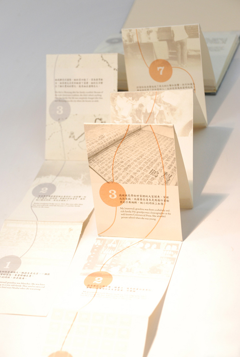
Rongfei Geng Handcrafted Book

Rongfei Geng Handcrafted Book

Launched in 2009 — and now in its second version as of March, 2012 — FPO (For Print Only) is a blog dedicated to the visual stimulus and the detailing of the development and production of printed matter: Annual reports, books, business cards, stationery suites, collateral materials, posters, packaging and anything else where ink meets substrate.
The name of the blog is inspired by the decades-old tradition of labeling images, illustration, and/or text that are not ready to print yet as FPO, “For Placement Only.” The play on words was very straightforward: Our blog will be only… for… print, so we named it For Print Only, “FPO.”
The content of FPO is generated from submissions by our readers. When provided, we will have the full scope of production details and project overview but we will also post projects where we are unable to gather all that information if we think they are worth sharing despite the lack of details.


The Elmwood Story


Ladies and gentlemen: Bob Mould! I have had a few projects in a row where the design process has flowed like a really great conversation. With Silver Age, not only did I fall in love with these songs, but Bob Mould is a peach; he’s generous, articulate, and clearly relishes collaboration. He kicked off our dialogue by sending me a photo of the sign for Crissy Field, which a) made me cry (I miss San Francisco!) and b) described a typographic sensibility that set the tone for the visual language. The typeface here is Monod Brun, designed by V.H. Fleisher in 2009.
Bob also knew he wanted a symbol of some sort to represent the album. In the end, I designed ten symbols—one for each song—which all appear on the back of the album. I will hold off showing the rest of the artwork until it’s printed because there is going to be some production bling that I would hate to shortchange.
In the meantime, check out this mammoth list of tour dates.


Maggie Fost is a designer and educator. She received a BA in Studio Art from Bowdoin College and an MFA in Design from California College of the Arts. In the intervening years, she worked at Heckler Associates in Seattle; and Shockwave.com, Macromedia, and the Exploratorium in San Francisco. In 2004, she was invited to be the Designer in Residence at the College of Design at North Carolina State University, following which she was appointed the first art director at Merge Records, where she remains. Now operating from Toronto.


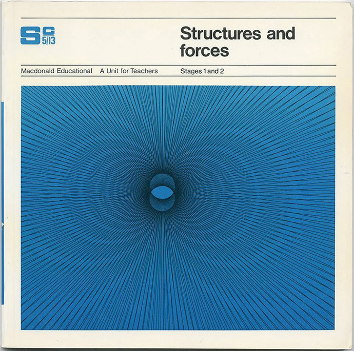
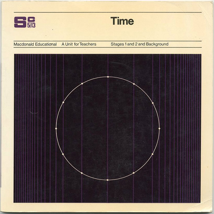
macdonald-educational-covers-1

macdonald-educational-covers-2


We are A-Side: a full service creative studio set in the UK with a global reach.
We offer bespoke design solutions spanning all media; we create and nurture successful brands, we offer art direction, graphic design and illustration all the while freely jumping the divides between image and product, design and art, the flat page and the moving image.
We work collaboratively with our clients. Providing a flexible service, we prioritise our client's wishes, to help realise their vision and ensure mutually successful solutions. We are committed to producing design of the highest quality and our work reflects our ethos - accessible, human, and crafted.
Please get in touch if you would like to discuss a project.


kid cups

ads

placemat


OAT COMBINES BROAD INFLUENCES AND AN ORIGINAL VIEW OF POSSIBILITY TO CREATE NEWLY RELEVANT IDEAS, METICULOUSLY EXECUTED FOR CLIENTS WHO TRUST IN OUR TASTE.
THE CREATIVE PROCESS IS A WINDING, MAGICAL AND IMMERSIVE ENDEAVOR. WITH EACH PROJECT, THE EXECUTION OF A UNIQUE IDEA IS AN OPPORTUNITY TO INTRODUCE SOMETHING NEW TO THE WORLD.
OUR STUDIO LIVES IN A SMALL STOREFRONT OF A FORMER BARBER SHOP, WITH CREAKY WOOD FLOORS AND LOTS OF NORTHERN LIGHT.

Edwin van Gelder - FRANCISCO VAN BENTHUM

EDWIN VAN GELDER 
Edwin van Gelder is an independent graphic designer based in Amsterdam, 
the Netherlands. After graduating from from Utrecht School of the Arts in 2004, 
van Gelder founded Mainstudio and has worked under the name ever since. 
Mainstudio's projects include editorial design, books and visual identities for 
clients within architecture, art and fashion. 
Clients include Frame Publishers, Wiel Arets Architects, and the Dutch Fashion 
Biennial. Van Gelder has won various international awards (Art Directors Club New York, 
Best Dutch Book Design) and has been part of different international design juries, 
such as Art Directors Club New York, Selected A - Graphic Design from Europe, and the 
Art Directors Club the Netherlands. 
His work, as well as interviews, has been published in various books and magazines, 
including +81 Magazine, Slanted, and Process Journal of Design. 
Van Gelder loves typography, magazines, identities and books. His design approach 
is 
creating a clear concept, while always playing with the context of the information 
and 
looking for something unique in every assignment.


Bauer Design


Phaidon


This is an online blog which allows people to keep up to date with the art and design industry. A design gossip page!!


Copyright 2010. All rights reserved.

RSS Feed. This blog is proudly powered by Blogger and uses Modern Clix, a theme by Rodrigo Galindez. Modern Clix blogger template by Introblogger.