When it came time to design my website I was quite apprehensive, having only been taught 3 2 hour sessions I was unsure whether I would be able to produce something in the time scale and to the standard I wanted to. I think that had we had more sessions and maybe one on one sessions with either Simon, Phil or Lorraine I would have felt more positive about the concept of coding. I know that coding is not an essential for graphic designers but for this brief I did not want to create something which looked amateur.
I started off with my 3 scamps of my initial ideas at the beginning of the module. The designs are very simple and easily doable but I need to think about the coding in more detail.
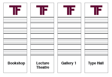
Thumbnails:
I had lots of ideas for this brief and I could not choose between them all, I created a few thumbnails with my layouts and ideas on then to see what they would look like as a set. I think that my thumbnails speak for themselves and I am happy with how simple and realistic they are.
Scamps:
From my thumbnails I went on to choose my favourite designs and create them in large as scamps.
Wireframes:
I then had to think about the coding rather than the design. I created some wireframes to show the different measurements in pixels. This was a really hard task at the time because I was still not confident with my coding.
Starting out:
I have a clear idea of how I want my website to look so now it is time to start to code it in Dreamweaver. I started out by creating my logo in Illustrator then adding it to the top of the page in a navigation bar like we did in the session with Simon. I changed the colour of the container to check that the bar fit perfectly down the left hand side of the page. I was happy with this stage now I had to add my buttons. I did this the same way Simon had taught us; in illustrator with the layers.
I added the buttons into my code on Dreamweaver and this happened:
The logo seemed to be the problem so I removed it. This worked but I did not want to have to take the logo off the page.
I could not understand why this was happening and I couldn't fix it either. I asked a few other people if they could help me with it but I quickly found out that some other people were having a similar problem or did not understand the coding at all. I think that had there been more sessions people would be more enthusiastic about web design and also have more of an idea how to use Dreamweaver correctly.
Because of this problem I had to make some changes:
I spent so much time on my navigation bar that I had to move on with the bar in a mess I started to experiment with my illustrations and adding them into 2 columns like Simon had shown us in the session. I did not take into consideration that the margins would make the shape bigger which in-turn meant the columns would not fit onto the screen side by side.
I had to alter the design for my website because I could not get the links for the naviagtion to go down the left hand side of the page. Because I did this it meant that I had to change my scamps and wireframes.
Scamps:
I put together a quick navigation bar without the logo which worked really well. I still wanted to include the logo within my work so I carried on experimenting.
I managed to get the logo to fit into the navigation bar which was a relief.
Experimenting with the homepage:
Trying to get the columns to work:
I managed to get the columns to work as I deducted the margins from the overall size which meant they would be side by side.
Rough homepage:
I now had to add the content to the other pages:
Getting to know the grid:
Adding rows and columns
Once I had understood how to add different rows and columns to the website I could then make a start on the pages which required one.
The History Page:
I chose the rectangle photos as they looked the part on the page.
Trying out the grid on the inspiration page:
Rough proposal of the resources page:
Rough Submit page:
Using W3 Schools to add a submit section:
The resources page on my website was the one which I was not exactly sure what to do with. Numiko came into LCA and spoke to us about digital design and they showed us one of their websites. I knew immediately that I was going to use it for inspiration for my resources page of my website.
Simple iconography:
Interactive games for children.
Had I had the knowledge to produce something like this I would have loved to for my resources page as my website is not exactly tailored for children and would have been useful to have an aspect which is more so aimed at them.
Adding to the resources page:
I came up with some quick vector illustrations for my resources page and tried them out in lots of different ways and columns until I got the designs to fit within the dimensions.
Adding columns:
Adding the designs into the columns:
This did not work:
I had to make sure that the dimensions fit perfectly or it wouldn't work.
Getting the text to fit within the text box:
Removing the green to see what it looked like without colour:
Adding headers:
Trying to make the images larger:
Playing around with placement:
The finished page:
Using W3 schools for a submit page:
I was not taught how to add a submit form to my page so I went onto W3 schools and taught myself. The end product works though it is not exactly how I would like it. I would like to develop this further depending on time.
The code:
Homepage:
History page:
Inspiration page:
Resources page:
Final website:
Homepage:
History page:
Inspiration page:
Submit page:
Resources page: