'Through a process of collect and categorisation of content specific to your own research theme, you are required to focus on information graphics. How can you translate facts, figures and statistics into clear and understandable visuals?
Using your research theme explore information graphics through one of the following outcomes :
- PRODUCT AND PUBLICATION
- PRODUCT AND PACKAGING
- PRODUCT AND DISTRIBUTION
Your resolution should reflect your own practical and conceptual interests (derived form your given research theme) within the field of contemporary graphic design.'
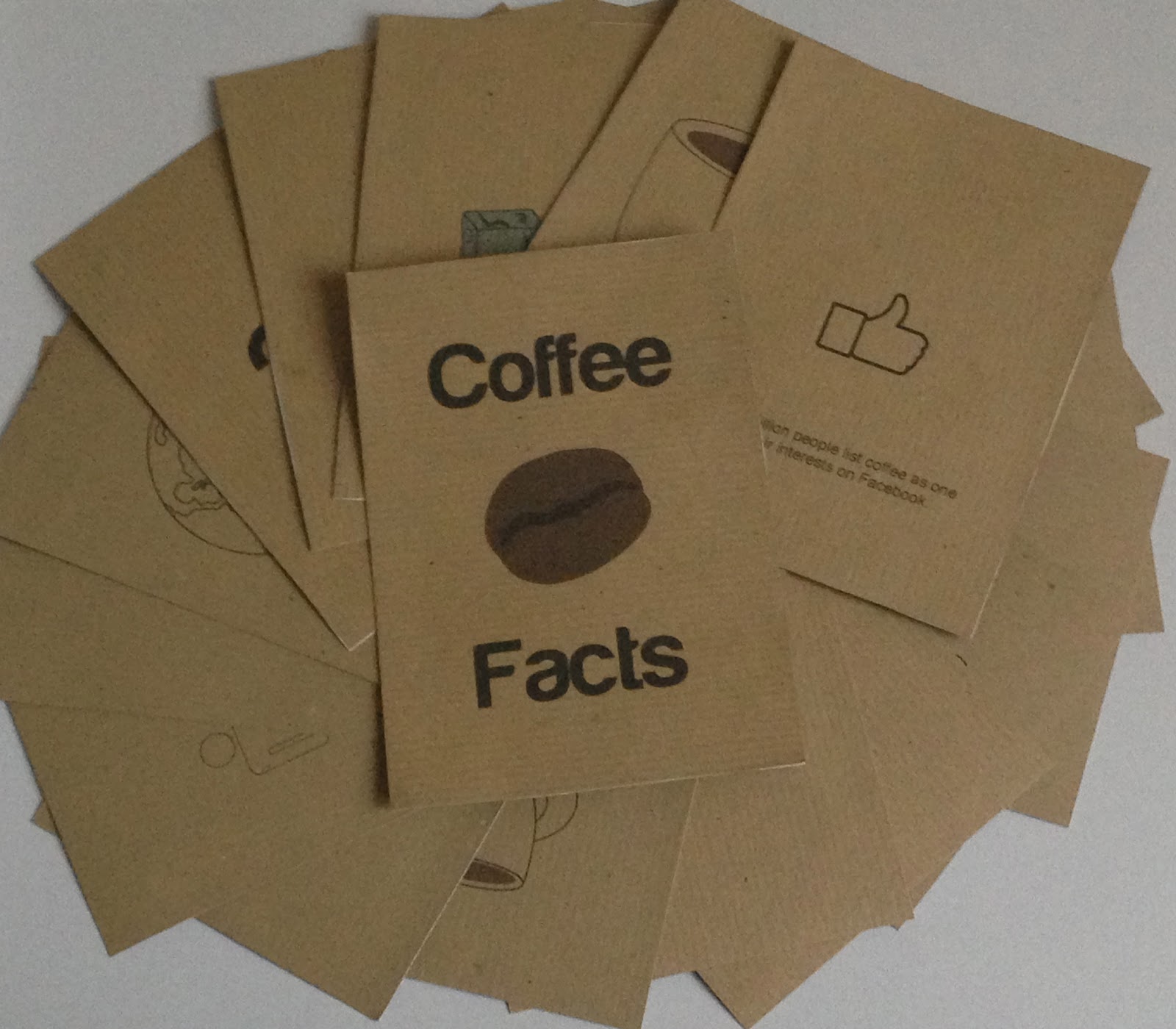
My research theme was Coffee. I looked into many different products that I could design from Packaging, Mail shots and Books. The idea I have settled on is a book. I plan to design a book of coffee facts. It will contain facts and figures about the history of coffee, coffee vs. tea, most popular coffee choices,
Developmental drawings...
For the first page of my booklet I want to include a little piece of history about how coffee was discovered. When researching this I found that it was discovered by goats in Ethiopia. When I originally started sketching out ideas for my first page I wanted to make it as simple as possible with black line illustrations produced on illustrator. I drew a goat on Illustrator many times but as I am still learning how to use it effectively and professionally it has taken me longer than usual.
I mapped out different paper folding options but I think I would like to have each card individual with the option to create a set off cards rather than a booklet. My favourite idea from above is the concertina option which I have used before in other projects.
I planned to create a series of 6 cards with each displaying a different fact about coffee including the history and some random facts which people might be interested in. I would like to include the facts I gathered when I first looked into the topic of coffee.
One of the facts which I found interesting when I looked into coffee was that America was the highest buyer of coffee but not the highest consumer. I drew an outline of the USA on illustrator, I planned on filling the shape with block colour but tried this out when printing and decided it looked too
Another strange thing I came across during my research was that coffee had now become more popular than tea. This was very surprising as tea has always been commonly associated with the United Kingdom. I drew 2 very simple illustrations of a coffee cup and a tea cup.
I had the idea to print my booklet onto brown paper in order for it to look more organic and original. As we are learning about colour theory in design principles I am very uncertain about using colours in my work as I want it to look professional. I have used 2 simple shades of brown in my coffee and tea illustrations but after some print testing and a few observations from my peers I have decicded to keep the colour but make a few changes to the shade I have used. With my biscuit illustration the colour looks fine on the brown paper, I think this is because it is a lighter shade of brown which does not contrast as much as the darker shades.
One bit of feedback I was most intrested in was that people did not mind that I had not added colour to my illustration of the world. I think because it is such a recognisable image that people can identify it without colour.
When it came down to typeface I chose the simple and clear font, Helvetica. I wanted a light typeface but not one which was so light that it was not readable or legible. I think it works well as it is a global typeface which people use in all professions. The language I used when creating each page is quite informal as I wanted to make it a enjoyable read for people who were interested in the subject. I intend to have my booklet in coffee shops as well as for people to buy from shops like Urban Outfitters.
Further development illustrations

As I am creating a booklet based solely on facts and figures I chose to look up how popular coffee was as a beverage. The results were eye opening. I found that water was the most popular beverage with coffee coming up in close second. I am not a coffee drinker and therefore did not know how incredibly popular it is. I chose to produce a really simple illustration taking inspiration from a sports medal ceremony. I drew 2 very simple rectangles and made one higher than the other. I felt that in doing this I did not have to put numbers on the podium as people would understand what I am aiming to achieve. When it came time to choose an image which was suitable for water I chose to produce a simple bottle of water without a brand name on it. I am unsure as to this aspect of my design as it may not be as obvious what I am trying to represent. I do, however, think that the text at the bottom of the page would clear up any doubts people have towards the image. To represent coffee I re-used an illustration which I had made for a previous page, I think this adds to the continuity of the booklet as there is a common theme running through it.

Another fact which I discovered was that New Yorkers drank 7 times more coffee than any other city in the USA. There were a variety of ways which I could have represented NYC but I chose to go for the simple map outline. The reason I did not choose something generic like the Statue of Liberty or the Empire State Building is because I feel is over used in many different aspects of graphic design that it would not be as original as the map outline. Another reason why I chose this design was to keep the continuity as with the rest of my booklet.


'Coffee will only grow between the tropic of Cancer and the tropic of Capricorn.' I did not know whether there were any specific symbols which could be used to represent these tropics and after some research found that the astrological symbols would suffice. I chose to produce the symbol versions of the signs instead of the animal equivalents in order for my designs to look more professional. I am still learning how to use Illustrator to its full potential and found my drawings looked more professional at a smaller scale and in symbol form. Overall I am very happy with my symbol illustrations and think the use of the symbols is in keeping with the rest of my designs.
I did a similar thing with this design for the highest traded commodity
Maps is a similar theme which runs through my booklet, I have used them in the place of other generic images to represent a place. One of my facts is about the coffee consumption of the UK. I chose to use the map of the country as I think it looks very simple in the black outline and works well on my brown paper.
My pages are very simple which I like but I do think that because I have made them simple that I maybe need to make several more as they do not take me a long time. When my designs are on a white background I don't think it looks very good. When printed on brown paper my designs look more economical and organic like coffee. I was going to print on coffee stained paper but decided that if I was going to mass produce this is would not be suitable.
During my research I found an example of a pie chart in a coffee cup, one of my facts would warrant a chart of some kind so I tried it out. I produced a simple cup image from birds eye view and marked out 1/3 with the pen tool. I am not fully happy with it but I will take it along to the crit and ask for peoples opinion.