You will produce at least one mock up, with content and initial layout ideas, of your publication for the crit on the 26th. Ideally, this product will act as a proof before you go to print, so you can get an idea of how the content and the layout are working and so minor issues (such as typos) can be rooted out. Although bringing unbound pages can be useful, a mock up of the publication itself is most useful, so do make a mock up of this product. Note that this does not mean that you have to use the same stock or even the same binding technique -- but a good physical representation is what we are after. We don't expect you to have all the research done at this point; however, we do expect it to be quite advanced. Please expect for these mock ups to be written on.
This is also an opportunity to improve upon your crafting skills. As such, we want you to create packaging to house your publication -- at least three nets -- in order to hone crafting skills as well as your design for packaging skills. Please bring these constructed net mock ups as well as your publication mock ups to the crit on the 26th.
–––––
My crafting skills, especially when it comes to packaging could do with improving. I took out three different books from the library to find some interesting nets which I could use to package my publication. I created these as rough mock ups and tried them out with some existing publications which I had in my room. Once I had done this I then produced the nets on thicker paper and in more detail.
I started out by looking at nets which resembled an envelope. The inspiration behind this idea came straight from the Oscars. A significant event in the Oscars history saw the result of the winner be in a sealed envelope, I thought that this would be a great way to link to my research topic.
––––
Simple Envelope:
For my first design I wanted to look at the most simple envelope I could produce. The envelope which is used for the Oscars is very simple and is sealed with a wax seal. The envelope has to be simple enough for people to open in a short amount of time live on television. Working with this concept I made this envelope. I put it into context using an existing book, though this book was significantly thicker than my publication will be I did identify a flaw; the envelope would not close comfortably unless it had a deeper edge. I plan to develop this envelope idea and merge it with a folder like concept. I hope that this will mean that the publication and the envelope can stand alone rather than the publication look too thick for the envelope.
––––
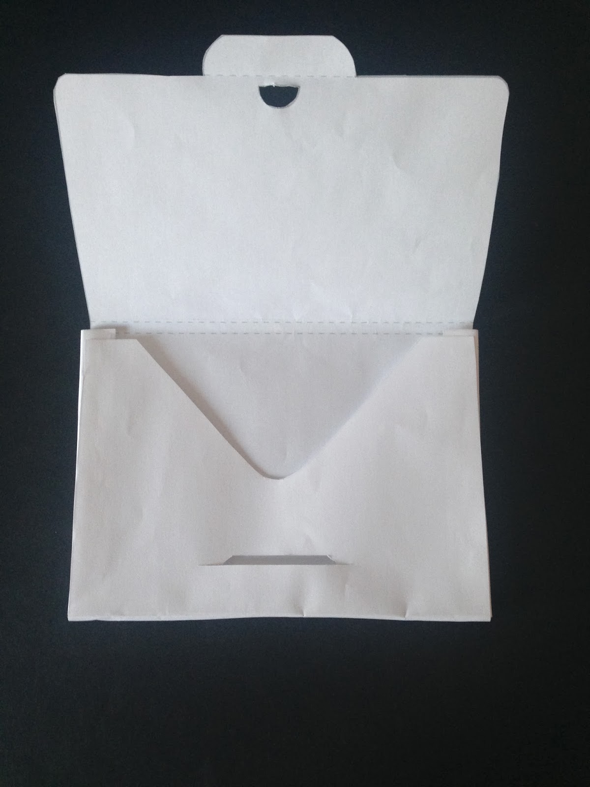
Box Envelope:
This envelope had a much deeper width than the first, I think this is going to be an essential aspect to my packaging. I created a rough mock up on standard printer paper (80gsm) which was very frail and unable to hold anything. Once I was sure that the design was developed enough I created it in a thicker stock and tried it out with another publication. I think this design works really well and I particularly think that the seal is simple and easy to open. Though a wax seal would be more fitting, this design works for the time-being.
------
Improved stock design:
Simple seal, easy to re-seal. A wax seal is more fitting though it does have some flaws. A wax seal is harder to re-seal whereas this design can be sealed as many times as one might wish. I think this is something to take into consideration when it comes to printing and constructing my final publication.
––––
Sleeve:
Another option I could use is a sleeve, this would ensure that the publication can be simply pulled out and slid back inside the sleeve whenever the user might want to. This option also does not require any seal which makes it easier for the user to handle. I created the sleeve on printer paper and identified that it was hard to get out without a section cut out which would allow the publication to be removed easily. When I used the thicker stock I added a cut out section which meant that part of the publication could be seen and therefore pulled out easily.
Added section:
––––
Book Sleeve:
Whilst I have been designing the layout for my publication I have noticed that 16 pages is not a great amount of space for the information I need to show. With this in mind I thought I could test the concept of the publication and the packaging and see how they could become one. I found a net for a sleeve which had a DPS within it. I thought this might be a good way to have more information without overcrowding the publication and also meeting the brief requirements.
––––
Sealed Sleeve:
I liked the idea of a sleeve because it is possibly one of the most simple packaging examples. I do want to pay attention to the Oscars and how the result is given inside a sealed envelope because I think it is an effective way to make a direct connection. I looked at the idea of creating a sleeve which can be sealed. I found a net which, when made, looked more like a file than a sleeve, I used this net and developed it into a sleeve within another piece of packaging. I think the best way for this to be sealed would be with a press stud. This would allow the publication to be re-sealed which I think is very important.
The net could be made into a sleeve very easily if the flaps at either side were decreased in size and stuck to the first folded piece of paper:
––––
Envelope with Concertina:
I became interested in how I could make the packaging and my publication become one thing. I came across a net in a mailshot book which had a information printed onto the envelope. I thought that maybe I could have my publication in a concertina which was attached to the envelope. I think this idea could work though it does need more development for the publication to fit and not look out of place.
––––
Carrier:
Another way that my publication could be packaged would be to have a carrier for it to sit in. I saw a net for an invitation which was held in a bag shaped net. I produced the mock up and then began to think about how I could alter it to fit in with my topic. I decided to experiment with the idea of the Oscar statuette holding the publication together. The idea worked though the mock up would have to be altered in order for my publication to be held together in a stable way.
The Oscar:
––––
Pocket:
This idea might be more suited to something which I will produce for the second part of this brief though I do think it could work for my packaging. I chose it because I liked the concept of the publication being presented as something which is extra special, I think that with my topic the idea of something being extra special and high end this is a perfect way to do this.
––––
DPS:
Our publications have to be 16 pages (not including the covers) I have been laying out my content on an A5 document because I want to challenge myself with finding ways to fit all of my informaiton into a small space. I experimented with this net of a circle invitation though I saw it more as a way to get more information onto a page. The larger parts of the circle would act as a DPS but the smaller parts would just be add-ons for the page, this presents me with a great way to add more information onto a page without breaking the rules of the brief.