I chose a pure intense pink tin and placed it against pieces of paper which each had a different saturation.
I first photographed the tin on a neutral piece of paper to show how pure the shade of magenta is.
By placing the tin on top of a desaturated piece of paper affected the perception of the colour. The tin appears to be darker than it actually is.
There is a clear temperature shift between the bottles which was very interesting to investigate and explore.
I placed the 'warmest' bottle against a brown background to see if a darker neutral shade would affect the temperature of the object. I think it has not necessarily changed the temperature but has affected the tone and hue slightly.
The warmest and coolest bottles placed next to each other showcase the spectrum between the objects.
Placing the bottles onto a green background which stood in the middle of the spectrum was very interesting as the the temperatures were slightly affected.
Experimenting with the green bottles against a completely different coloured background which had a higher temperature highlighted the initial temperatures which I observed.
By placing the warmest bottle against a background which was warmer still made a significant difference to the temperature. The bottle now seems to be a lot cooler.
Contrast of Extension
For this experiment I used the two complementary colours red and green. The shade of red I chose was quite a pure red which against the murky green had a high contrast.
red is more dominant against green but reflective material means a moderate contrast of extension
There is a low contrast of extension here as the red folder is taking all of the attention.
Moderate contrast of extension as both are fighting for attention, red winning slightly.
Low contrast of extension
Low contrast of extension as the red folder has made the green background seem darker than it is.
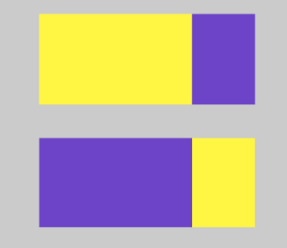
Orange and Blue
Low contrast of extension as blue is taking all of the attention
I tried the same concept with a different object. This time I chose a larger object. The contrast of extension changed as the orange shoe meant that there was a high contrast as the attention is in higher demand.
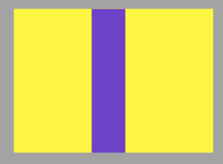
To explore this further I choose photographed a neutral shaded paper with a highly saturated magenta paper. I changed the amount of paper which was in the shot to show how the colours fought for attention.
Here there is more magenta paper and less neutral paper. Their is a moderate contrast of extension as the magenta paper does not have to fight to be seen.
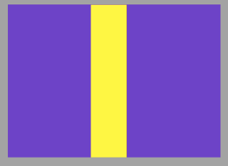
By increasing the amount of neutral paper which was shown in the shot has only slightly affected the contrast because the magenta paper is more saturated and has a higher tonal value. I am wondering whether this will not changed throughout the experiment as the neutral shade is not having to fight to be seen due to its tonal values. I think this experiment could have been different if I had chosen another highly saturated colour such as blue or green.
The contrast of extension has changed slightly as the magenta decreases in visibility, it is still the most dominant colour.
The contrast of extension has not changed significantly throughout my experiment as the magenta is still the most eye catching.
By covering the magenta paper almost fully the contrast of extension is still quite moderate as they work quite harmoniously.
After this failed attempt I chose two highly saturated objects both with high tonal values.
There is high contrast of extension as both are fighting for attention.
These coloured objects show a high contrast of extension due to the tonal values of each. The blue material covers the majority of the magenta bag and they are both fighting to be seen. I would say that the magenta bag is possibly winning as it is quite a bold shade.
In this experiment the blue material is still fighting for attention even when it is over powered with the magenta bag.
Contrast of Hue
Natural Light
I found this very interesting. By placing a yellow piece of paper onto the green background a blue tint can be seen.
Artificial Light
I observed the change in colour when photographed in artificial light.
The green became more dominant as the material is quite reflective.
Complementary Contrast
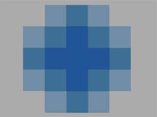
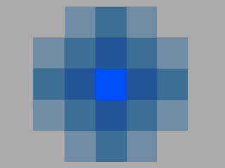
Simultaneous Contrast