Archives

Alphabet Soup Illustrator : Final Typeface

This is my final typeface which I created on Adobe Illustrator. I have never used this programme before so I found this task very helpful. I did struggle with colours though, I think I would benefit from a workshop about colours.


After some consideration I chose to print my typeface off in black and white. I think my use of colour will have a negative effect on my overall mark and grade. 


Introduction to print

I have never used any of the print processes before so I found this workshop very interesting. We were introduced to 3 print processes; mono print, lino print and letterpress.


Above are all of my experiments. I found monoprint very useful and I enjoyed letterpress very much. I don't think I will use Lino print very often as I found it quite to cut into the rubber as is shown on the above image. I am very excited to try my hand at screen printing which I think will use a lot within my degree.

Alphabet Soup : Illustrator

To showcase our growing software skills we have to create one of our ten letterforms digitally and make them into a full typeface. I created my typeface on photoshop then traced from it, this time we had to use Adobe Illustrator.


When I produced this design on Photoshop I drew one piece of popcorn and duplicated it several times changing the shape each time. I layered these piece up on top of an existing letterform which meant the popcorn was sticking out of the letterform. I really liked this style but I wanted to try a different method on Illustrator.

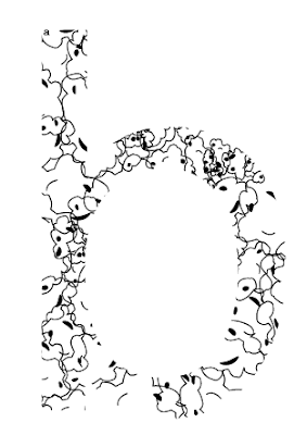
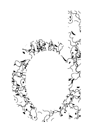
 I first drew around a piece of popcorn with the pen tool. I added small circular lines and used the width tool to give the pieces a bit of edge. I then duplicated it making some of the pieces smaller. I filled a 10x10 square with different sized popcorn and added another layer containing a letter, I then masked the popcorn square with the letterform to create the effect of the popcorn inside the letterform.


 The effect I ended up with was very different to my hand rendered letterforms but I did find it quite interesting.


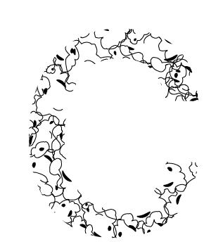
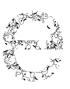
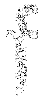
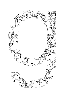
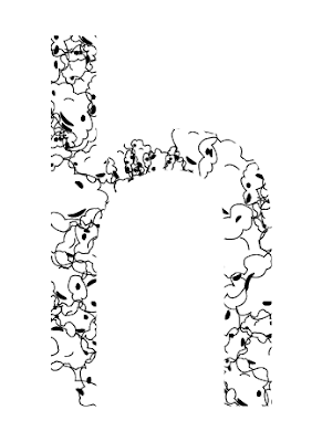
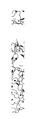
I chose to recreate my ten letterforms in black and white to show my understanding of Illustrator.  I am going to create the whole alphabet in this style but I am also going to experiment with colour. I will also try out this style with uppercase letterforms and glyphs.


Experimenting with Adobe Illustrator


As part of this brief we are allowed to use colour. Obviously the colour I chose was yellow. First I quickly chose a musky yellow as I am only experimenting and this will not be in my final designs. I created one piece of popcorn and duplicated it many times in different sizes and from different angles which I then built up into a large shape of overlapped popcorn pieces. I masked the design with an A to get the effect that the popcorn is inside the letterform. 


 I think this worked really well though it did not create the same effect I had when I hand drew my letterforms.


As I had created this set of popcorn pieces on an A4 sheet when I transferred the whole image onto a 10x10cm box it came out like this (Above). This does not work as it is too overpowering and bold. I had already produced my popcorns on a 10x10cm box and would have to alter them and add colour.
I thought that my popcorn piece didn't look very believable, I decided to experiment with shadows. I added a small shadow to this piece but I found that it still looked quite fake. This could be a good thing or a negative thing as I have not specified whether my popcorn was meant to look real or not. 


I experimented further with shadows and the effect of them in a layered format. This idea has not worked as it is not clear which piece is which as they all merge together. 


As I used Illustrator more I became more confident with the pen tool and chose to draw a few more versions of popcorn. During my initial research for the alphabet soup task I found that popcorn did not look perfectly round and that no two pieces are the same. I experimented with 3 pieces of popcorn which I then used in my final design.

To create my final typeface I continued to mask all of my letterforms to a 10x10cm box full of my new popcorn images. I added colour to each one. I chose Yellow but decided to use a few variations of it. I think it worked really well though I do think it looks more effective in black and white. These are some of the things I must consider when I come to print my work.


I also chose to experiment with my typeface in lowercase.

Putting my typeface into practice


After playing around with my typeface and putting it into words I think I prefer the black and white version as I do not think I have chosen the correct colours. This is something I hope to improve on during the course and my first year. 


Design Practice News Story Task

For this studio workshop we were split into groups of 4 and asked to come up with a list of new stories from the last 12months. The stories my group came up with were :


  • Jubilee
  • Starbucks not paying tax
  • Chinese Pandas sent to Edinburgh zoo to mate
  • Beyonce having a baby
  • Euro 2012
  • Costa Concordia
  • Redbull Freefall - Felix 
  • Phone hacking
  • Olympics
  • Dark Knight Rises Shooting
  • Abuhamsa
  • Lance Armstrong being stripped of titles
  • Whitney Houston dies
  • Syria
  • Joseph Kony
  • Wiki Leaks
  • Greece's financial problems
  • Chris Moyles steps down from BBC Radio 1 Breakfast show
We then had to pick our 3 favourite stories :

  • Chinese Pandas
  • Costa Concordia
  • Lance Armstrong being stripped of titles

Alphabet Soup Part 2 Weekend Task

As a short extension task we had to use our typeface. Simon and Amber showed us a selection of different products with different types, the task was to think of a product or company which would best suit our typeface. I chose Ticketmaster which is a very popular website to but concert tickets from. One limitation with my typeface is that I am restricted to the topic of music.


Alphabet Soup Illustrator Workshop

From our past Alphabet Soup brief we have to produce the full alphabet, based on one of our letterforms, on Adobe Illustrator.

As many of us have not had any experience with Illustrator we have a series of workshops to help build our confidence with the software. 

I  our first workshop we were introduced to the pen tool, we had to complete a series of tasks which, when completed, meant we could draw almost anything using illustrator.


I found the tasks rather simple though I did have a problem with the last 3 points in the last shape. I especially liked Illustrator because of the ability to create curves which I have problem with when I am drawing by hand. 

The second task we had to complete was a trace of the letter G.


I found this task quite hard and was unable to finish due to the time the workshop finished. I will have to carry on experiment with illustrator and complete the trace of the letter G.


Another way to create the letter G is to use the pathfinder tool. I favour this method more as I use a similar technique when designing on photoshop.

The pathfinder tool is really easy to use as it is simply building up images from shapes and cutting them out of others to build one letterform.

Using the width tool I edited the letter 'e'.


When creating typefaces on illustrator we use an existing typeface and edit them slightly which means anyone can use them for free. I did this with a letter E, L and X.


We also tried out the blend tool which I think could be really useful using my time on the course.


My Alphabet Soup letterform of choice was full of popcorn illustrations which I designed on Photoshop. I used the pen tool to recreate this on illustrator but also tried my hand at using the pathfinder tool. I found the pathfinder tool easier as I am used to creating image this way on Photoshop. One thing I would like to learn how to do is to warp shapes to make the illustration look more realistic.


Copyright 2010. All rights reserved.

RSS Feed. This blog is proudly powered by Blogger and uses Modern Clix, a theme by Rodrigo Galindez. Modern Clix blogger template by Introblogger.