
In our group we brainstormed a variety of ideas and came up with the idea of individual flashcards from each region of the UK. Our idea to illustrate which card was for which region was to use a stereotypical image of a person from that region.
We started out on this task by researching the most common accents in the UK.
- Queen's English
- Geordie
- Scottish Highlands
- Yorkshire
- Welsh
- Northern Irish
- Cockney
- West Country
- Scouse
- Glaswegian
- Birmingham
- Lancastrian
- Mancunian
- Black Country
- Estuary English
- Norfolk
- Potteries
We then chose four which we felt best linked to the accents of people on our Graphic Design course:
- Scouse
- Geordie
- Essex
- Yorkshire
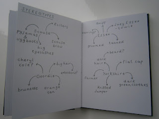
Stereotypical representations of a female/male from each region:
- Scouse

Characteristics
- Rollers
- Big Eyebrows
- Fake Tan
- Geordie

- Yorkshire

Characteristics:
- Flat cap
- Stubble
- Farmer like
- Essex


Characteristics
- False Tan
- Groomed eyebrows
- Quiffed hair
We went on to finding popular slang phrases or words from our chosen regions which we think that people on our course would find hard to understand.
We first planned our ideas on an A3 design sheet where we mocked up each one of our illustrations and certain characteristics we wanted each one to have. For example we associate rollers with people from Liverpool.


Our main inspiration for the characters came from a past LCA Graphic Design student, Dean Gray. We liked his simplistic designs and decided to have our own take on his illustrations of the LCA tutors.

We chose to keep our designs very simple as we didnt want to overcrowd the final flashcard with too much information and images.


Group Crit

We were split into crit groups where we had to present our work to another group of people, we then gave feedback on each others designs. I found this very beneficial as students are our audience, it was great to get feedback on what we need to improve as well as what work we have produced that is very good.


The feedback we got from our crit was very helpful:
After our first progress crit we chose to change our final flashcards to make them more user friendly and accessible.

As our designs have to be quick and easily recognisable we had to make our characters very stereotypical. Though some people may find offence in these designs we hope that most people would see the humorous side and think these ideas are quirky and entertaining.
Our flashcards needed to be very simple, eye-catching and straightforward. We did mock ups of what we wanted our cards to look like to make sure that, as group we all agreed on what the final design should look like.


When the time came to design our final flashcards we did make some alterations to our mock up but we all felt that these changes were beneficial and added to the design significantly.
We assigned a colour to each region in order for each card to be different. We chose colours which thought best suited the region and the character we had designed for each.
Font was also a big factor in the final design, one member of my group spent some time researching the regions and their stereotypes, from this research she chose the fonts from Dafont.

Our final designs


We plan to present these ideas in powerpoint presentation which explains our ideas in more detail.

Group Crit

We were split into crit groups where we had to present our work to another group of people, we then gave feedback on each others designs. I found this very beneficial as students are our audience, it was great to get feedback on what we need to improve as well as what work we have produced that is very good.


The feedback we got from our crit was very helpful:
- More Clarity
- Enlarge
- More explanation of where and when we are going to give it to students
- Check that the slang is correct
- Maybe more on accents rather than slang
- With regards to our 3min presentation we needed to each have our own element to talk about
- Enlarge text
- Try another layout
- Take the text out of the speech bubble
- Missed the point, should have done accents rather than slang
- Size
These suggestions were very helpful though we decided to keep some aspects of our designs the same as we felt that they were sufficient and answered the brief. We did, however take lots of the suggestions on board and changed our designs significantly to appeal to the audience.
After our first progress crit we chose to change our final flashcards to make them more user friendly and accessible.


Presentation Feedback Sheet

