Archives

OUGD503: Responsive - Studio Session (Studio Brief 1 - Individual Practice)

Today we had our first session for Design Process (Responsive) This is part one of the module, Individual Practice. As a preparatory task we were asked to identify 5 briefs which we would be interested in completing. We took these to the session and used them to learn the basics of brief analysis. 

To start off the session we were asked to identify what we as individuals want to get out the module:
  • Experience within the industry
  • Developing my skills
  • Contact with clients and professionals
  • A wide variety of briefs to show versatility
  • Learn how to be professional within the industry
  • Improve on my time management skills
  • Identify which briefs are best suited to me
  • Be able to approach a brief with confidence
We were then asked to feedback our answers to come up with a list collectively:
  • Time management and discipline
  • Understanding realistic time scale
  • Effective professional communication
  • An award/prize/fame
  • How not to get exploited
  • Try out a range of briefs
  • Identify individual practices
  • Brief analysis
  • Creative Compromise
  • Exposure
  • Portfolio development
  • Contacts and opportunities
After we had done this we were asked to answer another question by ourselves and then feedback to the group.

Why do we think live/competition briefs are useful?
  • Designing for a purpose and a use within the industry rather than a fictional college need
  • Industry experience - deadlines, terms condition etc
  • They are challenging
  • Allow versatility and exposure
  • Working within the industry
  • Allows us to see how others (not within college) view our work - Feedback
The group list:
  • Improving professional design skills
  • Challenge of a professional brief
  • Commitment to being more than a student
  • Developing clearer/more effective working practices
  • Real world benchmark
  • Professional responsibilities
  • Gathering contacts
  • Professional feedback
  • Professional experience
The second part of the session had us looking at our briefs and explaining why we had chosen them.
  • Content interested me
  • I can relate to the content
  • Ethics relate to my way of thinking
  • Quick brief
  • Allowed a creative range and opportunities to further my skills
  • Wide range between all of them
Group List:
  • They look straight forward
  • They are short briefs
  • Try new things outside your comfort zone
  • They were free to enter
  • An interest in the content
  • Ethically motivated design
  • Prize
  • Best available
  • Creative scope/freedom
  • Range of problems
Brief selection should start with us deciding if it is appropriate.

We were split into groups and each given a brief from YCN. My group was given Eurosport.

We were asked to read over the brief and then answer a series of questions:
  • What is the problem?
They need to attract customers
They are competing with ITV
  • What is the brief asking you to do?
Promote to a wider audience
Attract more viewers
  • What is the brief trying to achieve?
Attract more customers/viewers
  • Who will benefit?
Eurosport - Money
Viewers - coverage
  • What is the message?
Eurosport is better than ITV
  • Who is the audience?
Male and females 18-55 
Event fans
  • How will the message be delivered?
30 second TV spot
Website banners
Printed material
  • Can you foresee any problems with this? or specifically how the message will be delivered?
Advertising platforms are all wrong for the target audience
People will be more attracted to ITV because it is free

These problems are all relevant but the bigger problem is the fact that the bigger companies are loosing money and need ideas but do not want to pay a company to rebrand when they can have a student do it for free. 

For the next session we have been asked to:

Choose a brief be it one we already have or an new one which suits the task more. This should be a competition brief we must answer the 8 questions above as well as 4 new ones:
  • Why have I chosen the brief?
  • What do I want to get out of it?
  • What do I want to make/produce/do in response to the brief?
  • What do I NEED to make/produce/do in response to the brief?
We must also have some initial brainstorms and thumbnails to show our ideas

OUGD504: Design Production - Design for Web Development

Thumbnails and idea development


These are my thumbnail ideas which I came up with during the web session. I wanted to talk in some detail about each of the ideas to help myself to develop them and decide which ideas work and which ones do not. 


My first idea is to have the homepage mirror the design of the tube map which hopefully trigger an immediate reaction with the target audience. I want to make it very interactive and relate to the subject matter. My idea is to have the site act as a virtual experience for the user. I would like the whole site to be on one continuous page as I think this would be the most simple way of illustrating the tube lines and make the audience feel like they are a part of the site. I had the idea of some of the points on the homepage linking to one of the other pages which in my case would jump through the website to the one section about the specific subject. I think it is important to keep the user in charge of their web experience and let them be able to choose where they will be going next. I know that if I were to be looking at the site I would like the option of my own choice. 


My second option is to produce something which is quite a standard template and would be very easy for a user to navigate around. I have taken inspiration from many different templates and other sites which use this layout. I have chosen to have my navigation bar on the left hand side of the page but I would also like to explore the idea of having it in the typical placement at the top of the page. I think that this way my homepage could become more than just a page with links to other pages on, it could act as another page of content. At the moment I have drawn out 3 images and one text box which would be on the page, this could be a short information/about explanation of what the site does and would allow the user to quickly identify if the site is what they are looking for. 


This is the other variation of the above design with the navigation bar along the top. This a more common layout for a website and might be a more simple option to go with. I have kept the content of the homepage quite simple but still informative. This is one of the least complicated ideas I have had and one which I think might work really well and gain good user experience. I would like to have the page fit within the constraints of the screen but I am aware that not all users are forced to have the same size screen and might be using a phone to view the content. 


This option is one which I like very much. I would like to have a title at the top of the page with 4 circles (only drawn three here) each with an information graphic inside which link to another page. I think that info graphics would fit really well with the theme as the tube is a form of info graphic. The  circle would link to the underground symbol and also from the map itself. I have three options with regards to identifying what is a link and what is not and they are to have each info graphic be a link to a page a rely on image alone to illustrate a topic or I could have the title of each page written underneath the info graphic which would make sure that the user would know they were a link failing all of these options I could have each link look like the underground logo/roundel. I have illustrated this above. 


This idea is very minimal and uses negative space. The idea I have had is to have the title in the top left hand corner with a drop down menu which appears when the user clicks on the title. This idea is something which could be really different and has many positive and negative traits. A positive is that it will look aesthetically interesting and will make the user think but these could also be negatives. Users spend 2.5 seconds on a website before they decide to leave the page, a problem with having so much negative space is that the user might think it is not a website and might not know that the look at links they need to click on the title. I could combat this by having the menu permanently visible but I still think some users might not like the idea of the site and would not visit it.


This idea follows on from my first idea. I really like the idea of having the site move around like the user is on a virtual tour of the tube. I know that it is something I would be really interested in. The idea I have for this is to not have any links which the user can click on, it is simply a scroll to see. It would be a continuous page like the first idea I had but it would be a lot less interactive in terms of user experience. This idea would have the user dictated to and would take away the users freedom. Some people do not like this option and would not stay on the site for very long. I would have to mock up the idea and carry out a questionnaire to see what users think. 


This idea is the most image based I have had. I was inspired by a site I saw on Awwwards. For this option I would have an image as the main point of the site and a navigation bar which pops up when the user hovers over the right hand side of the page. This is not a very common convention of navigation but it is a different user experience. The problem which could come with this idea is that I have to source all of my imagery and this would be very difficult due to my subject matter. My site would have to be very illustration based as I would have to draw out most of my imagery. This is not part of my style of working but it would show versatility. 


This idea is very similar to my last one but the navigation bar would be fixed permanently at the top of the page. This would allow the user to see what links are available and give them the freedom of choice. The image I have drawn to represent the tube is a train which might not be the best image to represent my subject matter as I am mainly focussing on the tube map.  I would need to use something which would make the user relate to the subject automatically which might be the underground logo. 


My next idea follows on from the previous, I really like the idea of having an image in the middle of the page which would allow the user to relate to the subject and the underground logo is probably the best suited to this. The idea I have is to have the logo in the centre with links coming off it. This might be quite difficult to produce across other forms of media (phone) but it would be a really interesting idea to develop further.


This idea is a follow on from the info graphic idea accept the circles will not be in any specific order. This idea does not necessarily link very well with the tube map because it is very organised and uniform but I think it would be great for user experience. 


This idea is another continuous page concept, this would have much more content which is not shown with the design of the tube. I would have a typical timeline which gives details of the tube map and how it has evolved over the years. I would then have individual images which show the visual changes the tube map has gone through over the years. This idea would allow me to have lots more content on each page and also allows users to choose which page they want to view. 


For my final thumbnail I wanted to expand on one of my previous ideas. The idea of having the tube logo in the centre of the page with the links coming out of the middle might be quite hard to produce so this is another variation of that idea. I would have the logo in the centre to allow user identification but I would also have a navigation at the top of the page. I think this idea would be really successful and really easy to navigate around. 

OUGD504: Design Production - Design for Web Primary Research Working Professionals

I am a student ambassador and for one of my first jobs I was part of a focus group about our college website. This focus group was really beneficial for me as I was able to find out about the process of web design and the steps which are taken before a site is designed. 

It was in this session that I was introduced to two designers from Enjoy Digital in Leeds who spoke to me about a possible placement over the course of the year. Not only do I have the opportunity of a placement but I am able to ask their advice about web design and the industry on a whole.

After my first web session I had some questions, I e-mailed the agency with my questions and received some answers very quickly. These are very detailed and give me an excellent insight into the business and the processes that go into design everyday.

My E-mail:

...

We have just been introduced to Web Design over the past few days and I was wondering if you could possibly answer a few questions which I have about the process of designing for web and how you receive feedback from it?

1. When you initially start developing an idea for a website what are your first steps?

2. How long after you have put together the design of the site will it take to develop it and prepare it to go live?

3. Do you work with industry standard templates or do you like to work with your own custom templates?

4. How do you find out if the websites you design are successful and engaging?

5. Why do you choose to work within web design?

6. What are your favourite websites?

Any answers you could give me would be great!

Thank you,

Ellen Setterfield


Reply...


Hi Ellen,

No probs at all. I've pasted your questions below and commented on them - Hope that's all useful and sorry for the late reply. Mad busy at the moment!!

1. When you initially start developing an idea for a website what are your first steps?

My first steps are always to run a discovery phase to understand (1) Business/ client objectives (2) User group profiles and their wants and needs (3) Current website (if there is one) website analytics review to look at site performance, popular pages and trends (4) Competitor site analysis to see what the competition is doing. I'd then only start design after a functional specification (http://technet.microsoft.com/en-us/library/cc543349.aspx)had been produced and would start first by mapping out the features with a wireframe (http://www.hotgloo.com/) to make sure layouts, features, content hierarchy and functionality are clearly laid out before then creating a design concept around it. In short, there's a lot to do before the crayons come out! : ) It's all about user experience and you need the discovery phase, functional spec and wireframes in place to do that.

2. How long after you have put together the design of the site will it take to develop it and prepare it to go live?

Totally dependent on the size of the site. Some take 2 weeks, some take 6 months. Although that's probably not a great help here are some examples; http://www.yorkshireday2013.co.uk/ This one took us a week. http://www.hml.co.uk/ whereas this one took around 3 months.

3. Do you work with industry standard templates or do you like to work with your own custom templates?

Not at all. Constraints are good to have as guidance in the design process but we like to derive our concepts from the up front work we do in defining the UX and design from that rather than just use templates, otherwise our sites would all end up being pretty samey and we'd never be doing anything at the cutting edge.

4. How do you find out if the websites you design are successful and engaging?

Google analytics is implemented on every site and if that's set up to monitor goals we can be pretty clear on what's working and what's not.

5. Why do you choose to work within web design?

I fell into it by total accident after graduating from a marketing and advertising degree but I love it now because every job is different and I learn new things about technology and people every day.

Looking into some of the links which were supplied to me:

Functional specification - 

In this process, the project team documents the project requirements, creates the design documents, and writes the functional specification.


At the beginning of this process, the project team analyzes and creates the requirements documents. There are four categories of requirements:
  • Business requirements
  • User requirements
  • Operational requirements
  • System requirements (requirements of the solution).
As team members design the solution and create the functional specifications, they must maintain traceability between requirements and features. Maintaining traceability serves as a way to check the correctness of the design and to verify that the design meets the solution’s goals and requirements. The usual method of maintaining traceability is to tag items in the functional specification with requirement IDs.
The design process gives the team a systematic way to work from abstract concepts to specific technical details. This begins with an analysis of user profiles, or personas. The team refines these personas into a series of use scenarios. Finally, the team refines each use scenario into use cases. This process is called story-boarding and results in the use scenarios document.
The team then uses the requirements documents, the use scenarios document, and the product and technology evaluations from the previous process to develop a functional specification that it submits to its customer and stakeholders for review. This is a detailed description, from the user’s and customer’s perspectives, of what the solution will look like and how it will behave. The functional specification serves multiple purposes, including:
  • Instructions to developers on what to build.
  • A basis for estimating work.
  • Agreement with the customer on exactly what will be built.
  • A point of synchronization for the whole team.
The functional specification is also the basis for building the master project plan and master project schedule. After the customer and stakeholders accept the functional specification, the team baselines (places under change control) it and begins to formally track changes to it. After the functional specification is reviewed and a baseline made, the team can only change it with customer approval.
The project team also creates the design documents that record the results of the design process. These documents are separate from the functional specification and are focused on describing the internal workings of the solution. The project team can keep them internal and change them without burdening the customer with technical issues. The design process has three levels—conceptual design (owned by Product Management), logical design (owned by Program Management), and physical design (owned by Development)—so the team produces the following three design documents:
  • Conceptual design document
  • Logical design document
  • Physical design document
The team completes and baselines each level in a staggered sequence.
The following table lists the activities involved in this process. These activities include:
  • Documenting the project requirements.
  • Writing the functional specification.
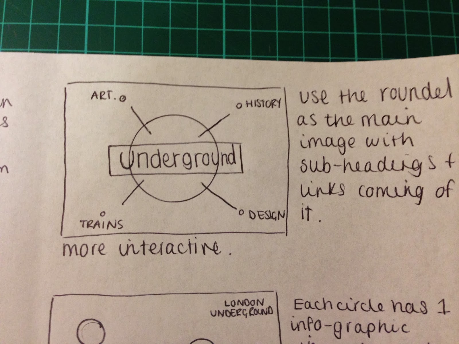
Wireframing -


Wireframing is something I am not yet aware of. To get a better idea of what it was about I carried out a quick google search. 


We are scheduled to do a session about skeleton design which I think is another word/phrase for wire-framing. 

Examples of the agencies work:


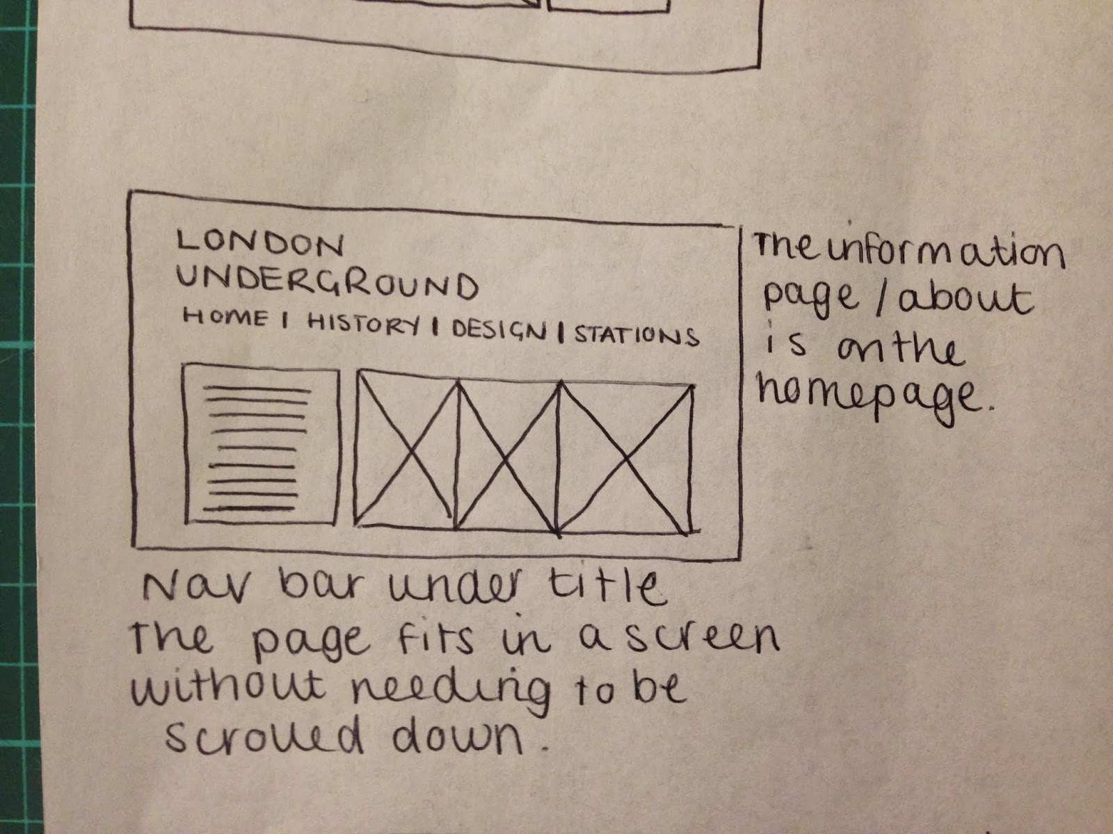
This website took the agency one week to design and develop. Looking at the website it is amazing to me how much can be achieved in one week. This gives me much more confidence in web design. 


This site took 3 months to develop and design. It is clear that there is much more content and interactivity but it is still clear that no matter how much time it takes to develop the site there is still visual consistency throughout both designs. 


OUGD504: Design Production - Design for Print Laser Cut Experiments

Today I went to a laser cut session to experiment with embossing as I was unable to attend a workshop at Vernon Street. I had my induction last week but I wanted to expand on the process more and develop my idea for the print brief.

I went to with two designs which I had quickly put together on Illustrator. I wanted to make something really simple which would test the embossing process the best. The first image I went with was a piece of block text in Bebas font. I like this font and use it often in my work but I mainly chose it because I thought it might work the best and produce a nice bold embossing plate. The second image I went with was the same font but in circles. This is an idea I have had for quite a while, I took my inspiration from the CMYK circles but added one extra circle to accompany the 5 letters of print. 


When I arrived I opened my file in Ethos which is the program which allowed me to size my design and choose the type of cut I wanted. Because I was cutting my design to be used to emboss I had to change the setting to negative so the laser knew to cut the background and not the letters. Once I had done this I could choose my material and send it to cut. 


I watched the file be cut and it took around 20 minutes. It was a very exciting experience and I think I will be using it very often in the future. 


When the file had been produced I was very impressed with the depth it had achieved. I was slightly concerned that the depth of the cut was not going to be large enough to make a successful emboss. I took some photos to show the depth of the cut. If I wanted to make my design deeper still I would have to send it to cut once again and this could make the letters stand off the page more. 


For my second design I had to make some changes. The circles I had produced were too thin and would not work for embossing. I quickly drew out another image on illustrator and unfortunately had to use a different font due to the computer not having Bebas installed. I still used quite a chunky font so that my design would be clear. I used Courier New Bold. As I was cutting to emboss I had to make my design negative so the machine would know what to cut. 


I did not have as much time as I would have liked on the machine so I had to send the design to the cutter in a very basic cut in order for it to be produced very quickly.


The end result was not as impressive as the first but I was still happy with the outcome. I 


Both of my designs we put onto one piece of MDF and each was cut out individually by the workshop professional. I took an image of the two designs on the same piece of material to look at the contrast which they had together. 

Embossing


When it came to embossing at Blenheim we do not have the proper machinery, this is at Vernon street. Even though it was not guaranteed we still tried it out on a manual press. We laid out our designs on a piece of padded material and laid tissue paper on top of it then handmade paper. 


We placed it in the press and applied pressure to it in the hopes that it would emboss. Our first attempt did not work very well but we were instructed to dampen the paper to see if that gave us a better finish. 


We placed it back in the press and applied more pressure. 


The outcome was as expected, it had embossed but not to the extent we would have liked. We tried this one more time and had similar results which was quite disappointing.


Overall this was a very beneficial process and I enjoyed it very much. There was one surprise I had which was that the circlular design embossed much more successfully than the block letters. I am not sure whether this has something to do with the distance between the laser strokes in the material or whether it is because it is a distinct shape. I would like to try to emboss with the blocks on the proper machine and see if the same result is seen.  


OUGD504: Design Production - Design for Print (Print Press) Development

During my research for the design for print brief I came across a design which inspired me to look into making my pack much more interactive. This 3D model which is cut into sections allows the audience to learn by being interactive. I love the idea of having something for my audience to construct and make for themselves and I think that having a make-your-own printing press would really boost my information pack. I favour editorial and publishing design but I do not want to simply make a book which gives reams and reams of information, I want to engage with the audience and make them want to read my information pack. 


The idea of having each piece displayed on one sheet/piece of thick card or thin MDF would make the idea much more organised and simple for people to understand. I do not know if I will be able to print onto the paper/MDF once it has been laser cut but given that a printing press is usually made from metal/steel or in with regards to very old presses, wood I would not necessarily need to print onto the material, the laser cutter would leave a mark which would add to the aesthetics of the machine. I would ideally like to have each individual piece of the model to be pushed out of the material like the above example but I am unsure as to how hard this might be. 


I would also like to have each piece clearly labelled with an accompanying information graphic illustrating where the pieces go and how they fit together. I do not want to forget the way I like to design and the affect I wish to achieve. 


Example of the pieces being pushed out from the material it has been printed onto. I have an idea of how I might be able to achieve this with different variations of laser cut but I would have to ask a professional to see what they would recommend. 


The designer has printed information graphic instructions onto the material, I like the idea of doing this but in my case I would like to have the instructions on a separate piece of paper as I do not want to be restricted with space. My target audience are not all forced to be experts in building models so I want to make it as simple and easy as possible for them to make. 


This model is much more detailed than  mine would be and has many more components than I would like to include. I would really like to include this as part of my information pack and think it would be beneficial to my audience and myself. 

Examples of old fashioned print press machines


If I were to strip this right back to the basic shapes I could produce something very similar to this design. I think it would be easy enough to construct which I think is very important because students don't want to be attempting to build something which is really complex. 


This is GuttenBerg's press which was the first machine able to produce moveable type. As my audience are Graphic Design students they will learn about Guttenberg when they cover typography. This machine, being so old, is quite simple in structure and would be a good choice to produce my model on. I could separate each component and construct something very simple for them to make.


I also looked at this press which is a little more detailed and interesting. I do not think that my skills are strong enough to produce something like this but I would like to try it out.


OUGD504: Design Production - Design For Web Workshop 3

Today we had our third studio session for the web brief. The first part of the session had us working in small groups and collectively coming up with a list of answers to a series of questions. We were asked to identify what common and uncommon conventions of navigation were.


My group said:

Common -
  • Scrolling
  • Links to other pages
  • Menu Bar
  • Drop down menu
  • Search bar
  • Homepage
  • Nav bar at the top or left hand side
  • Social media links
  • Auto updates intuitive to user
  • Breadcrumbs*
  • Navigation indication
*Breadcrumbs - Other links to pages which are not included in navigation bar (sub-categories)

Uncommon -
  • Holding/Landing pages
  • Navigation bar at the bottom or at the right hand side
  • Type to search (designspiration)
  • Eye tracker (Samsung)
  • 3D View
  • All content in one place (one page)
  • Dynamic content (refresh by scrolling)
Compiling these lists was not as simple as we might have thought. It was clear that there were quite a few overlapping features of conventions and some which might have transferred from different categories. After we had come up with these lists we shared them with the whole group and added to our lists. It was very clear that most other groups had had the same problems as us and found it difficult to identify the conventions. With some help from Loraine and Phil we were able to improve our lists and gain some understanding of the conventions.

We came up some questions as a whole group and explored into one of them:

How do we know it is navigation?
  • Underlined - some links are underlined which helps people to identify that it is a link
  • Colour - can change for links (blue is usually a link)
  • Content indicators
  • Writing the word underneath
After this task we were asked to create a flow diagram which illustrated the different pages we were going to have on our website. This task was not as useful as I had hoped because we had completed it in a previous session. In the previous session I created a flow diagram for my website and found it quite difficult to decipher which pages I should include. 

Before I carried out this task I created a mind map about what my target audience need to know.


After I had looked at this quite broadly I tried to whittle it down and make it more directed at my target audience. As I am targeting Graphic Designers some of my research becomes quite redundant and unimportant. For example, I have looked into the history of the tube and how it was built and who by, graphic designers do not necessarily need to know any of this information and probably wouldn't click on the link to learn about it. 

I had 4 pages which were quite solid:

  • Homepage
  • History (timeline of the map)
  • Harry Beck (designer)
  • The design of the map
I was stuck on my fifth page option. When talking to Phil I asked if I could just produce a 4 page website, he said that it would be better if I made a 5 page site because it is an odd number and would be more interesting in terms of grid systems. I went back to brainstorming and came up with another page which would apply to my target audience. 
  • The typeface
Though this is quite off topic it is perfectly suited to the target audience I have chosen. There could be an argument that it could be merged together with the design of the map into one category; Design. This would work well but could be too much information for the audience to get their heads around.


4 pages


5 pages


To conclude the session we were asked to look at the 5 website examples we were asked to bring in and identify the different grid systems which were used and draw them on top of the print out. 

INSERT PICS


Copyright 2010. All rights reserved.

RSS Feed. This blog is proudly powered by Blogger and uses Modern Clix, a theme by Rodrigo Galindez. Modern Clix blogger template by Introblogger.