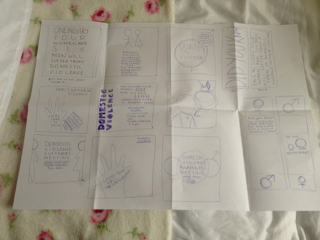
From the research I have done into mailshots I now understand their main purpose. My subject is very hard hitting and is not publicised enough. This would be a great opportunity to voice the statistics which people usually dismiss.
I had the idea to use the male and female symbols with a larger circle as the centre piece. I would use the drop shadow tool to make the symbols stand out but would use a solid colour in the centre. I had the idea to advertise a domestic violence awareness group in Leeds though I think after further research it would be better to look at the worst hit areas in the UK.
Hands was one of my first ideas. I was going to produce my mail shot on a cut out of a hand but found it difficult to figure out how to have it inside my envelope without folding it.
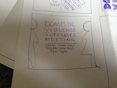
Simple design is sometimes the most successful way to convey a message, that is the idea I had with this design I wanted to include the information which I had displayed in my posters with the addition of domestic violence awareness meeting.
After producing my Message and Delivery posters I noticed that when the symbols were printed at full scale they were pixelated, this is because I drew them on photoshop. I created them on illustrator instead to make sure that my designs looked professional.


Leave your comment