I have chosen to focus my ISTD brief on web because I enjoyed it so much in the previous brief. I chose the Type Factory brief and felt like it lent itself to both print and web so I have produced both. I focussed most of my time coding this website for the Type Factory. The site consists of 4 pages, Home page, News page, Visit page and the Shop page. I have chosen to only have 4 pages because I feel that is the maximum I can achieve in the timescale given and also if I were to produce other pages I could create many many more.
I really enjoyed the web brief, once I had tried and tested my coding skills. I find it very rewarding and I think that learning about it has changed the way I see myself as a designer.
I started off this brief by making a list of all the things which need to be on each page. I have already designed some print products and I know what colours I need to and also which font. The designing of my website should be pretty swift as I feel more confident with the coding aspect. I made lists of everything which needs to be on each page and drew out some really rough scamps of my ideas.
Site map:
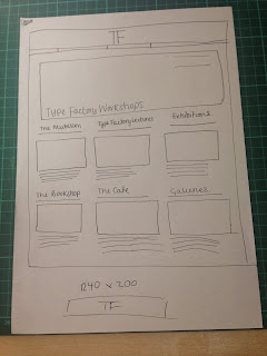
Homepage scamp:
News page idea:
Working out some of the measurements:
What needs to be on each page:
Working out the measurements for the homepage
News page idea:
Visit us idea:
Rough workings out in notebook:
Lorraine told us that we should add in all of our development, even if it was a messy piece of paper. I do not usually like to do this because I am a perfectionist but I have added in all of my notes a drawings from me designing my website. These might not make sense to everyone but I found them very helpful when it came to designing my website.
Final Scamps:
Homepage:
News page:
Visit page:
Shop page:
Wireframes:
Making my website:
I did not take as many screen shots as I maybe should have for this website and I think this is because I found it easier to code this time. With the Web brief I was learning how to code and I made many mistakes which I documented. I hope that my code can speak for itself when it comes to my ISTD website. I really enjoyed making this site and I feel like I am quite good at it. I would like to spend more time perfecting my skills and I know that this design is not the best I can produce though, I feel it is within the time scale I was given.
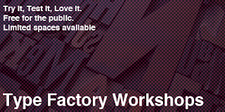
What's on banner:
Without the banner:
Homepage development:
Adding another column to get the text to line up.
The page on a larger screen is not central.
The news page on a larger screen.
When adding a £ sign onto my code it comes up with a strange A character. I am unsure how to combat this.
––––––––––––––––––––––––––––––––––––––––––––––––
Code:
Index:
News page:
Visit page:
Shop page:
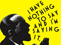
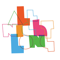
All images from website:
Final website pages:
Homepage:
News page:
Visit page:
Shop Page:
Overall I am very happy with the outcome of my site and I think it is a substantial amount of work for the time scale. I would like to add more to it and maybe revisit the project within the third year.











Leave your comment