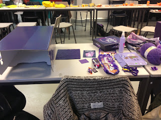
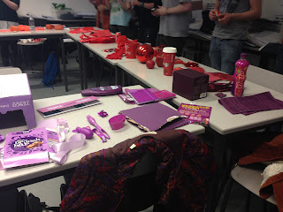
Our assigned colour was violet/purple. We had to choose a selection of violet objects and pantone match them. Doing this helped me to understand how designers ensure that the colours they use are exactly the same. I do not fully understand the pantone system but I hope to use it in the future and become confident that I could practice it in the industry.
We came up with the categories:
- Dark
- Desaturated
- Red
- Pure
- Blue
- Saturated
- Light
From the objects we brought in we identified the Darkest Violet we could.
Blue
Pure
Most Saturated
Red
Light
Our objects...
Pantone Matching.
Lightest - PANTONE 259C 20% TINT
Bluest - PANTONE 2766C 80%
Redest - PANTONE 208C TINTS
Most Saturated - PANTONE 259C 80%
Purest - PANTONE DE176-I-U UNCOATED
C-80
M-100
Y-O
K-O
Desaturated - PANTONE - DE 174-I-U
C-100
M- 100
Y-0
K-20
Darkest - PANTONE de 195-I-U
C-100
M-80
Y-0
K-40


Leave your comment