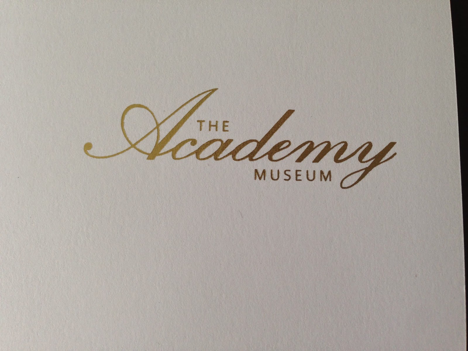
OUGD505: Design Practice 2 - Product, Range, Distribution (Foiling)

As the Oscars is such a prestigious event I want my branding to showcase this. I want to experiment with foiling for this brief, this is something I have never done before so it will be a learning experience for me. I have been told that the best way to foil is to use a screen and glue, I do not have the time to expose a screen to foil onto business cards etc. I asked around if anyone knew of a shortcut to foiling, Vicky told me that I could use the heat press in the print room. She said that if I printed my logo onto a piece of paper from the printer in the Graphics room and then took it to the heat press along with a piece of foil, that it would work and come out looking very effective.

I took her advice and gave it a go:


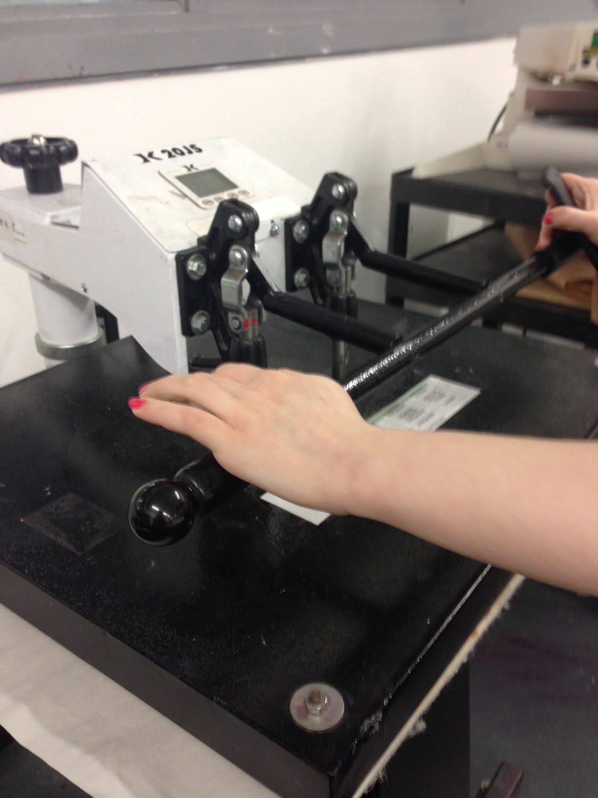


Overall I feel that for a first effort it went quite well, I intend to continue to develop my skills with this process and will hopefully be able come up with a professional outcome. 


Contacting commercial printers:

I want the outcome of the branding to look at professional as possible, to do this correctly I think that it would be more time efficient to foil at a commercial printers. I contacted LGP print in Leeds, the printers that I visited for the 504 module, and asked them about their foiling facilities. 


Response:


Upon receiving this e-mail I rang LGP to talk to Philip about the foiling. Phil explained that to foil in the way that they usually do it would cost over £50 which is a price I am not willing to pay for a project. He did say that he was having a new machine installed and would let me know if this machine would be able to do what I wanted it to do. He asked me to give him a call after a few days to confirm. 


__

I rang LGP today and unfortunately did not get through to Phil. I left my number for him to ring me back and I am waiting for a reply. 

__

I heard back from Phil who said that the machine should be able to do what I want it to which is great news. I explained the materials that I would need foiling and he said that I should send through the artwork and he would have a go at the foiling. 

e-mails between myself and Phil:


I am hopeful that the items will come out looking very professional and I will be able to use LGP's foiling services again in the future. 

Foils from LGP:


I am very happy with the final outcomes from LGP and will definitely be using them again in the future. 

Costing:

The one aspect of this brief that has put me off is the cost of it all. I spent £40 on foiling with LGP and £10 on the printing aspect. I spent this much to get the finish that I wanted but it would have been much better if I could have done this at a fraction of the price.

OUGD505: Design Practice 2 - The Academy Museum (Logo)

____

I intend to brand the Academy museum which is currently under construction in Los Angeles. One pro of the museum being unfinished but public knowledge is that I can use the information from the Academy website to feed into my design work. The museum already has a logo but I think that I can produce something better. I originally envisioned the logo to use an extravagant typeface for the word Academy and a modern sans serif font for the rest of the museum branding. I looked at my options for decorative fonts on Dafont and came up with two options:


Chopin Script:


Exmouth:


I chose these fonts simply because of the letter A that each had to offer. I like the A of Chopin Script but feel that the rest of the typeface is too bold and too fussy. Exmouth however, has a much less fussy A but the rest of the typeface fits very well with the uppercase. Out of the two I think that Exmouth is the best option for me to use, I also think that it will work better with the sans serif because it is more subtle. 

I put together a design sheet of possible logo ideas for the museum and presented it at the final crit. I used Exmouth primarily but I did create some that were more modern and used sans serif only. I wanted to do this because I had been told that an decorative font might be too much for the museum and as film is forever evolving a more modern font might be preferred. 

Design sheet:


The results from the crit was split between 3 and 10. These are both completely different which left me stuck and confused about what to do, I thought it would make sense to come up with a combination of the two. 


I am very happy with the outcome but I think that I should choose between one or the other rather than trying to merge two styles. I am using a similar concept for my exhibition and I want it to be a one of a kind logo. My personal preference would be to use the decorative logo because that is what I first envisioned the branding to look like, I do like the more modern logo though as it highlights the film industry, I could argue that the decorative logo also represents this with the sans serif font surrounding it. I think that by using the decorative font it highlights the prestige of the Academy, what they stand for and the Oscars themselves. 

Final logo alterations:

I am happy with my logo choice but I noticed some imperfections with the typeface Exmouth, particularly where letters joined into each other. I used the pen tool to smooth out these imperfections.


Before:


After:


I used the rulers and grid options to ensure that my logo was consistent and the spacing was correct throughout. 


Final Logo design:


I am very happy with the final logo design and I think that it will work very well throughout the museum branding. The next thing that I need to do is to create a set of brand guidelines for my museum, this will include colour schemes, stock choice and logo misuse.


OUGD505: Design Practice 2 - Crafting my Packaging

The packaging for my publication does not fit, it is too small. This is because I scaled the design down for a mock up. I now have to alter my net to make it fit.

I made a mock up with standard printer paper and then once I was happy with  the design I used black card.


OUGD505: Design Practice 2 - Studio Brief 2 (Final Crit)

____

Today we had our final crit for studio brief 2. I did not have alot of physical work to show but I did have concept boards and design sheets. I know what needs to be done how to finalise everything so this crit was a great opportunity for me to get feedback on the designs that I already have. 

I presented design boards with my concept and relevant research presented on them and also a design sheet of logo possibilities. 

__

Logo design sheet:


__

Concept boards:


__

Questions I asked:


  1. Which logo is the best?
  2. Should the publication be printed on uncoated stock or silk?
  3. Should the cover be on red paper with gold foiling?
  4. Opinions on the Oscar Moments logo?
__

Feedback:

  1. I'd print onto coated as the Oscars is quite fancy so it would keep within the aesthetic of the ceremony.
  2. Number 2 is my favourite logo, the hierarchy works brilliantly
  3. Only use gold foiling if it really needs it. It could add to the quality but it could also make it look tacky

  1. I think 10 and 12 are really effective and would form a good representation of the event
  2. Coated - silk will help to form a classy, up market aesthetic relevant to project theme
  3. Yes, Yes, Yes - all relevant to theme and will help to form a striking outcome
  4. Striking when placed on black background. I wouldn't personally change anything, also forms aesthetic similarity with logos 10 and 12.

  1. I like either 2,3 or 10. If I was to pick on it would be 3.
  2. -
  3. I really like the red, fitting colour (red carpet etc)
  4. Typeface works well

  1. I'd pick 1 or 2, they flow best, I also like 10. It depends on the approach you want to take. 
  2. Coated, glam it up for the Oscars. 
  3. Gold foil yes. I get the red because of the red carpet but I think that black and gold better represents the Oscars. Gold stationary, buy some spray paint.
  4. I like it but I think something in the same vain as the Academy Museum would be better.

  1. Logo 3
  2. Uncoated
  3. Red and gold looks like christmas
  4. Don't know but the envelope could be gold like the one in the Oscars

  1. Logo 12 or 13
  2. Uncoated
  3. Gold foiling. Not red paper
  4. Classy. Icon works well behind text.

__


I was very happy with my feedback and feel that it allows me to choose a successful logo from the selection I had put together. Personally I like logo 3 and logo 10. They are both so different and they would each market the museum in a different way. I like 10 because it is more modern but I originally envisioned the decorative font which is shown in the script font. I will experiment with both logos and come to a decision when I see it in context. 

The feedback said that I should try and use gold foil, I do think that this would be very successful but I am not sure that it will not look tacky. 


Copyright 2010. All rights reserved.

RSS Feed. This blog is proudly powered by Blogger and uses Modern Clix, a theme by Rodrigo Galindez. Modern Clix blogger template by Introblogger.