When I produced this design on Photoshop I drew one piece of popcorn and duplicated it several times changing the shape each time. I layered these piece up on top of an existing letterform which meant the popcorn was sticking out of the letterform. I really liked this style but I wanted to try a different method on Illustrator.
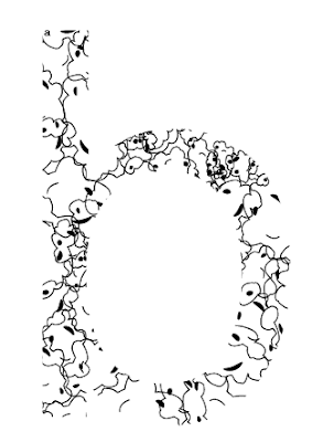
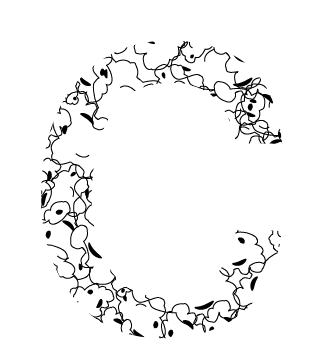
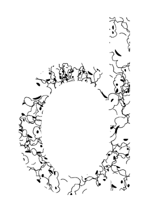
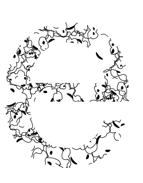
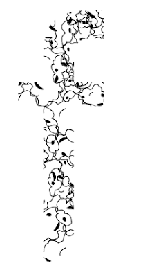
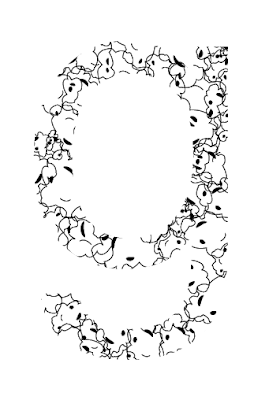
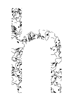
I first drew around a piece of popcorn with the pen tool. I added small circular lines and used the width tool to give the pieces a bit of edge. I then duplicated it making some of the pieces smaller. I filled a 10x10 square with different sized popcorn and added another layer containing a letter, I then masked the popcorn square with the letterform to create the effect of the popcorn inside the letterform.
The effect I ended up with was very different to my hand rendered letterforms but I did find it quite interesting.
I chose to recreate my ten letterforms in black and white to show my understanding of Illustrator. I am going to create the whole alphabet in this style but I am also going to experiment with colour. I will also try out this style with uppercase letterforms and glyphs.
Experimenting with Adobe Illustrator
I think this worked really well though it did not create the same effect I had when I hand drew my letterforms.
As I had created this set of popcorn pieces on an A4 sheet when I transferred the whole image onto a 10x10cm box it came out like this (Above). This does not work as it is too overpowering and bold. I had already produced my popcorns on a 10x10cm box and would have to alter them and add colour.
I also chose to experiment with my typeface in lowercase.
Putting my typeface into practice
Experimenting with Adobe Illustrator
As part of this brief we are allowed to use colour. Obviously the colour I chose was yellow. First I quickly chose a musky yellow as I am only experimenting and this will not be in my final designs. I created one piece of popcorn and duplicated it many times in different sizes and from different angles which I then built up into a large shape of overlapped popcorn pieces. I masked the design with an A to get the effect that the popcorn is inside the letterform.
I think this worked really well though it did not create the same effect I had when I hand drew my letterforms.
As I had created this set of popcorn pieces on an A4 sheet when I transferred the whole image onto a 10x10cm box it came out like this (Above). This does not work as it is too overpowering and bold. I had already produced my popcorns on a 10x10cm box and would have to alter them and add colour.
I thought that my popcorn piece didn't look very believable, I decided to experiment with shadows. I added a small shadow to this piece but I found that it still looked quite fake. This could be a good thing or a negative thing as I have not specified whether my popcorn was meant to look real or not.
I experimented further with shadows and the effect of them in a layered format. This idea has not worked as it is not clear which piece is which as they all merge together.
As I used Illustrator more I became more confident with the pen tool and chose to draw a few more versions of popcorn. During my initial research for the alphabet soup task I found that popcorn did not look perfectly round and that no two pieces are the same. I experimented with 3 pieces of popcorn which I then used in my final design.
To create my final typeface I continued to mask all of my letterforms to a 10x10cm box full of my new popcorn images. I added colour to each one. I chose Yellow but decided to use a few variations of it. I think it worked really well though I do think it looks more effective in black and white. These are some of the things I must consider when I come to print my work.
I also chose to experiment with my typeface in lowercase.
Putting my typeface into practice
After playing around with my typeface and putting it into words I think I prefer the black and white version as I do not think I have chosen the correct colours. This is something I hope to improve on during the course and my first year.




Leave your comment