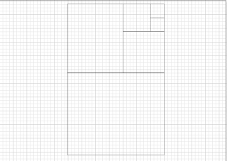
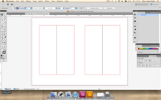
After putting together the content of my publication I started to make my own custom page sizes using the fibonacci sequence. I used simple measurements such as 2x2 squares as I wanted a square page, doing this gave me similar results throughout. After producing several variations I chose to start designing my booklet on an A3 document with a 10cm margin around the centre. I wanted to use the Van de Graaf cannon as I find it helpful to produce proportionate page designs and layouts.
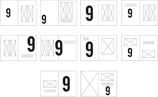
I did not have a clear idea of what I wanted my design to look like so I started off by creating some digital thumbnails. I find this easier to
Thumbnail designs...
NoZine inspired layout thumbnails.
When starting the design of my 10 DPS’s I began to explore typefaces and colours. I knew that I wanted a typeface which was clear and easily readable from a distance. The overall design of my publications was to be very minimal and clear, I had to take into account who the target audience would be if it were to be published. The audience I assumed was to be first year graphic design students or people who would like to know what Graphic Designers are up against everyday. Due to this audience choice it is essential that my design is clear and easy to read/navigate. I have chosen to number each of the facts clearly within the DPS. I was influenced by a design by No Zine as I feel it makes the page more eye-catching.
The audience have also influenced the amount of body copy I have used for each page, I feel that if there were paragraphs of body copy students would never read through the whole thing. As we were taught within the Design Principles sessions it is important to keep the attention of your audience.
I applied the rule of thirds to an A3 page which enabled me to set out my page proportionately. I find that I use this method a lot within my work but did not understand the significance within design.
Individual Design Sheets for each page...
I applied the rule of thirds to an A3 page which enabled me to set out my page proportionately. I find that I use this method a lot within my work but did not understand the significance within design.
This layout is my preferred design as I find it visually pleasing and easy to read and navigate. I think by putting the number in bold enables the reader to identify immediately what they are looking at. The short and succinct descriptions were very important to me when I started to design my publication as I wanted it to be a short and sweet statement explaining the point. The concept of my publication is that people will go off and research the points they find most interesting in more detail, this is used a lot when we are in workshops and sessions and enables students to be independent with their education whilst also having some structure.
When I produced my second page I wanted to have some slight difference in the layout. I thought about my printing method and stock and how each big block number would look through other pages. To overcome this I had the idea to alternate the distribution of the numbers onto left and right, this way when printed the numbers should overlap and the amount of black type showing through the stock would be altered significantly.
The content of my publication was based solely on the sessions we attended over the past year. I used the imagery which was shown to us in the sessions and reproduced it myself. This way I will have sourced my own images.
Recreated
The alignment of my text was of the up most importance. As my publication was very simple and minimalist I had to make sure that I paid extra attention to detail. I aligned the black line with the number and placed the topic heading in the centre.
10 DPS's So Far...
I am very pleased with my designs at the moment. I feel that the simple and minimalist aesthetic lends itself to my target audience and the succinct descriptions gives a no nonsense answer.
As I will be printing my booklet double-sided I want to make sure that the images are not over powered by the numbers on the reverse side. To avoid this I have placed the odd numbers on the left and the even numbers on the right, when printed this should mean that the numbers will overlap each other almost perfectly meaning there will be little disruption to the information. One way which I could avoid the images showing through on the reverse side is to use thicker paper to print onto. The problem with this is that I will have several thick pages and they will not fold and bind together comfortably. I am going to use 150 gsm catridge paper to print my publication onto, I have experimented with this paper and there are a few areas where this is an issue but I have decided that printing on thicker paper would not be a suitable option.
When thinking about how to bind my booklet I cam across some limitations with my design. I had produced 10 double paged spreads with the intent of binding them like a magazine, if I were to do this I would find that my pages were not correct as each would be a description for an image which had no relevance to it. I had to re-think this design limitation by making a rough mock up of my booklet. This enabled be to identify which pages needed altering and changing around. I have not yet chosen a suitable stock as I wish to experiment with different possibilities.
After changing my design set out I was informed that Adobe InDesign would have automatically changed my layout had I programmed it to do so. As I am at home at this point and do not have the supervision I feel I would need in order to produce this I have chosen to keep the layout as it stands and next time use the correct setting on the software.
I designed the content of my publication before the cover as I like to work this way. I did have a few limitations with this method this time around as I found it hard to settle on one idea. I tried lots of different layouts for the type using a grid and also just freestyle placing the text on the page. I wanted my font page to stand out from the rest of the book so I experimented with a block of black on the cover with white type. After a few experiments I chose to go back to the white background and black type as the stock I was printing on would make the black a murky grey colour if I printed a block of ink that large.
I liked the effect of staggered text like above.
I liked the idea of using curvy brackets to highlight the title of my publication but found it took away from the design rather than give it more impact.
When I finally settled on an idea I chose one which matched the interior of the publication. I wanted it to be very simple and to the point. The idea of this is that the reader will see the words Graphic Design and be drawn to it, they will then read 'ten things you need to know' and should hopefully be intrigued to pick it up and read it. I used the same layout for the back of the book where I credited myself.
I chose to end my publication with a quote from Massimo Vignelli. I did this to spark a curious interest within the reader as I feel that they should have some idea of who he is. The idea behind this is that the reader will research into Vignelli.
Applying the Van De Graaf cannon to my final design....
Printing on different stocks...
Part of this task was to print on a variety of different stocks to show that we can visually explore different avenues with stock. I printed 4 of my pages onto four different stocks (fifth would not go through the printer)
White Cartridge
Similarly to my final stock choice I printed onto white cartridge as I wanted see the difference in colour with a purer white stock. I do like the effect but I find the off white more fitting.
Tracing paper
Printing on tracing paper proved difficult as the ink dragged slightly. I had the idea of placing a piece of tracing paper between each page to highlight the grid, after some consideration of the grid I would use it did not warrant this extra paper.
Newsprint
I really liked the effect of the page printed onto newsprint as it added a certain antique element. I wanted to print my entire booklet on this kind of paper but it was too thin to print double sided without the detailed being disturbed by the information on the reverse side.
Cartridge paper
The paper I chose to use was 150gsm off white cartridge paper. I chose this thickness as I wanted my publication to be on thick stock but wanted it the close nicely.
Red paper
I printed on some red A4 paper as an experiment and found it very interesting. Even though from the photo the body copy can not be seen clearly I really liked the effect it had once printed. I could not have produced my publication on this stock as I had some pages with colour displayed which would have changed if the stock was significantly different.
I made a rough mock up of how the publication would look when printed and bound...
Final publication....


Leave your comment